BEYOND SCARCITY Illustration · Environmental Design · Fabrication · Campaign Design
The Idea + Build + Output
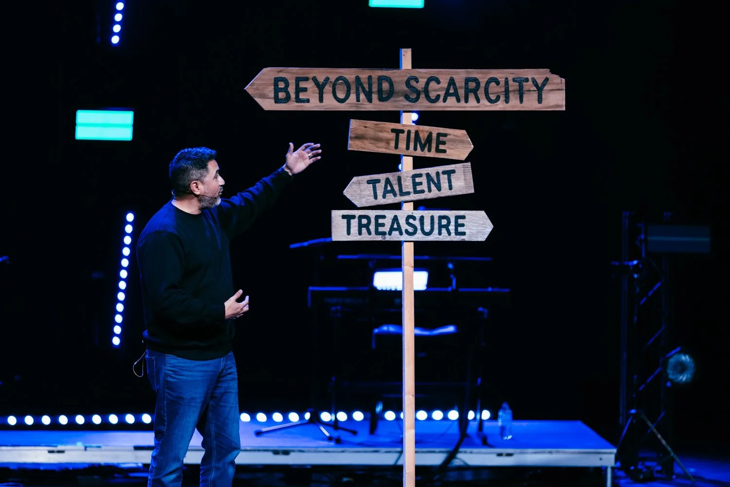
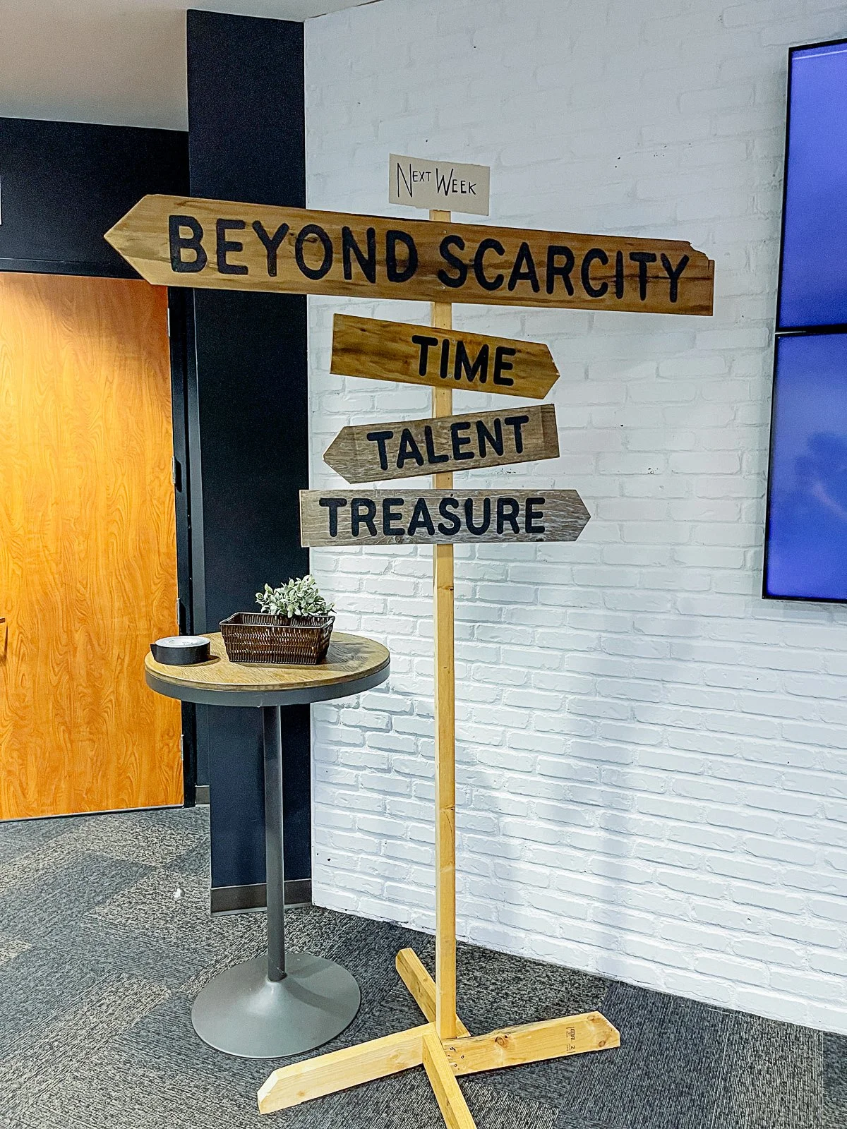
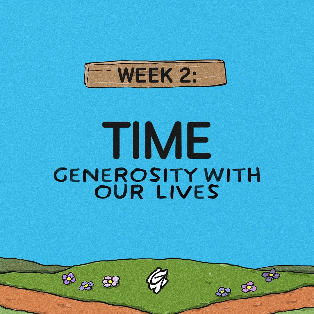
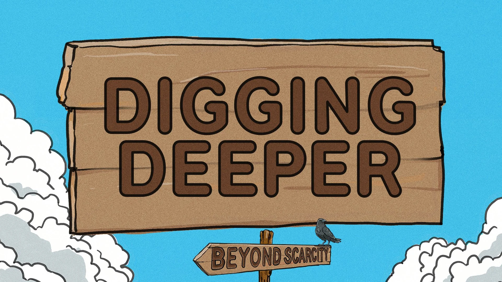
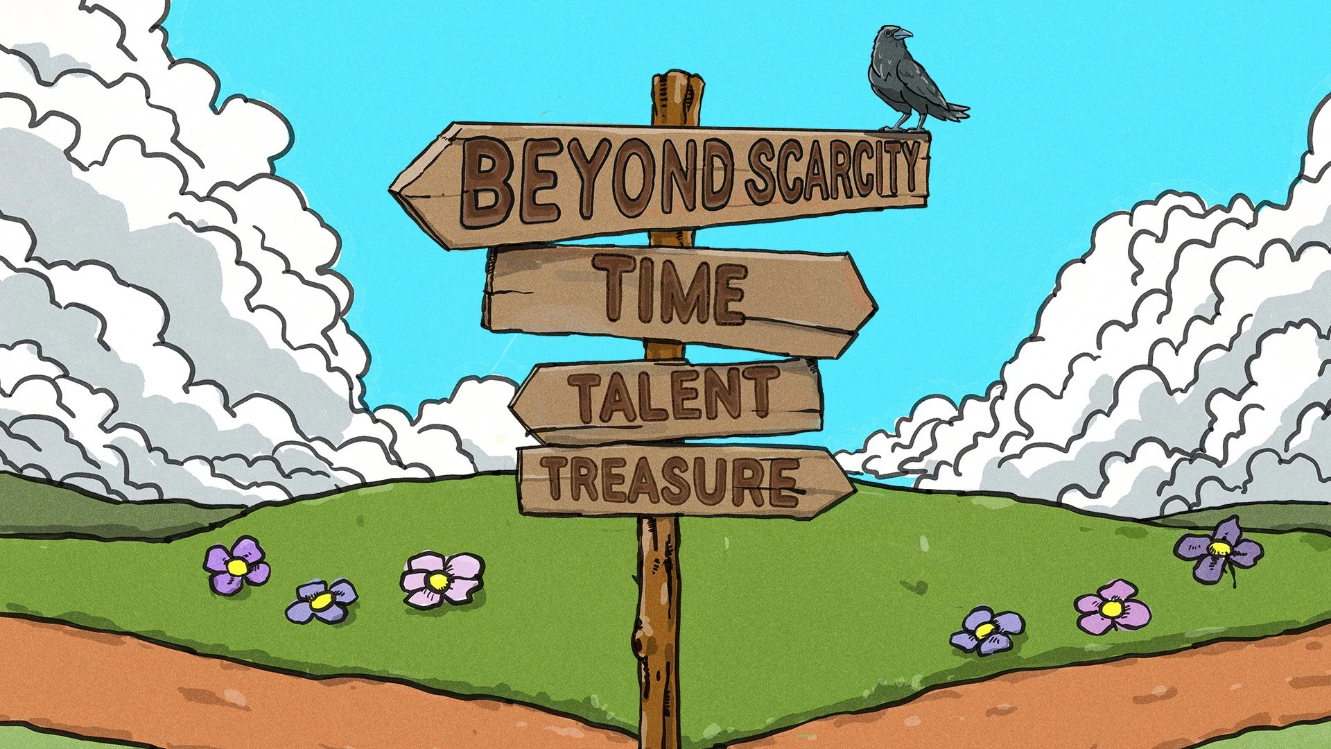
The concept was a crossroads signpost — four directions, four things we tell ourselves we never have enough of: Time, Talent, Treasure, and the series title pointing the way out. Built the full illustration in Procreate with a hand-drawn comic aesthetic, then translated it into every digital format for the campaign. Then built an actual full-size version out of real wood for the main stage — cut the arrow signs, hand-lettered the text, mounted it on a freestanding post. The physical prop became the visual anchor for the entire run: it stood in the lobby between services, appeared on stage during the message, and the illustrated version lived across social, broadcast slides, weekly message titles, a Digging Deeper teaching package, and the Facebook banner. One concept, two executions — one on screen, one you could walk up and touch.