

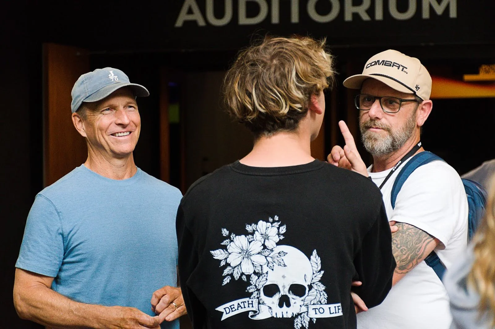
DEATH TO LIFE Illustration · Animation · Motion Design · Apparel
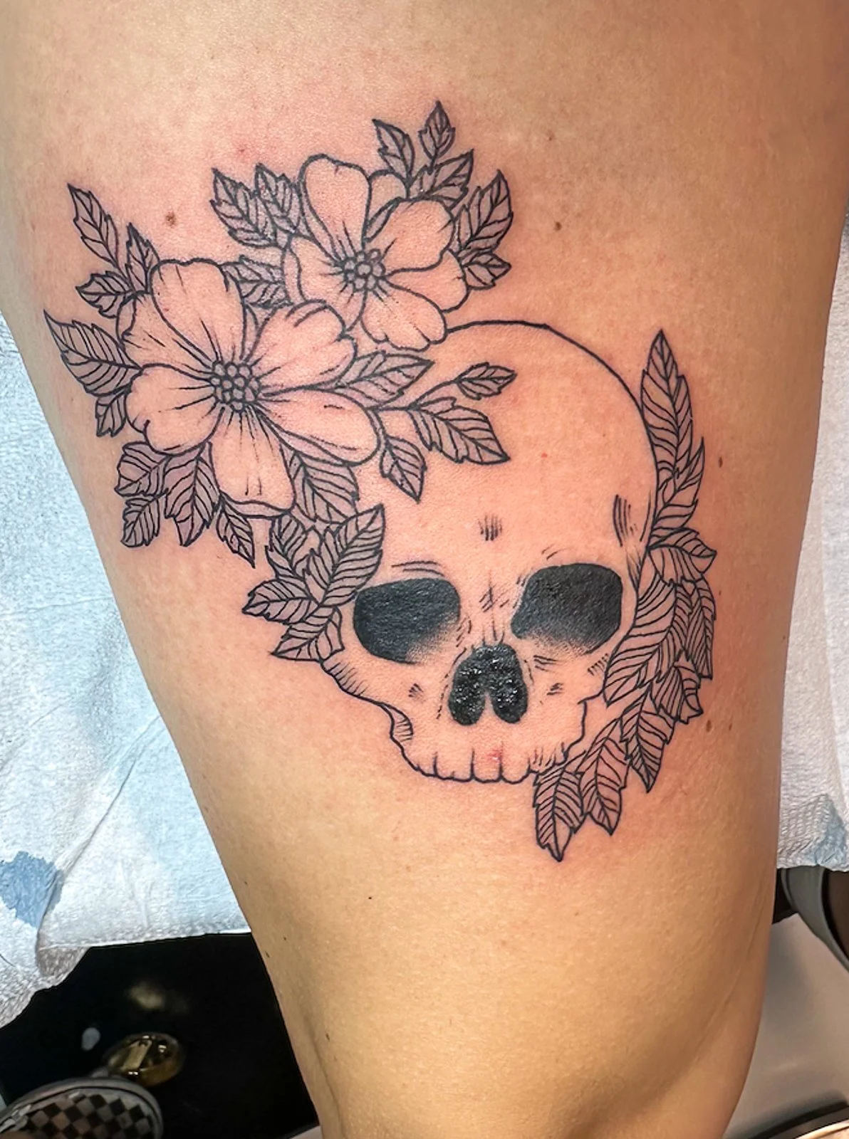
One person loved the design enough to make it permanent.
The Idea
Seven signs. Eight weeks. One of the most ambitious creative projects Gateway Church had ever attempted. The series walked through the Gospel of John from start to finish — tracing Jesus' seven miraculous signs through the eyes of John, one of his closest friends. The creative challenge was finding a visual language that could carry that kind of weight week after week without feeling repetitive or predictable.
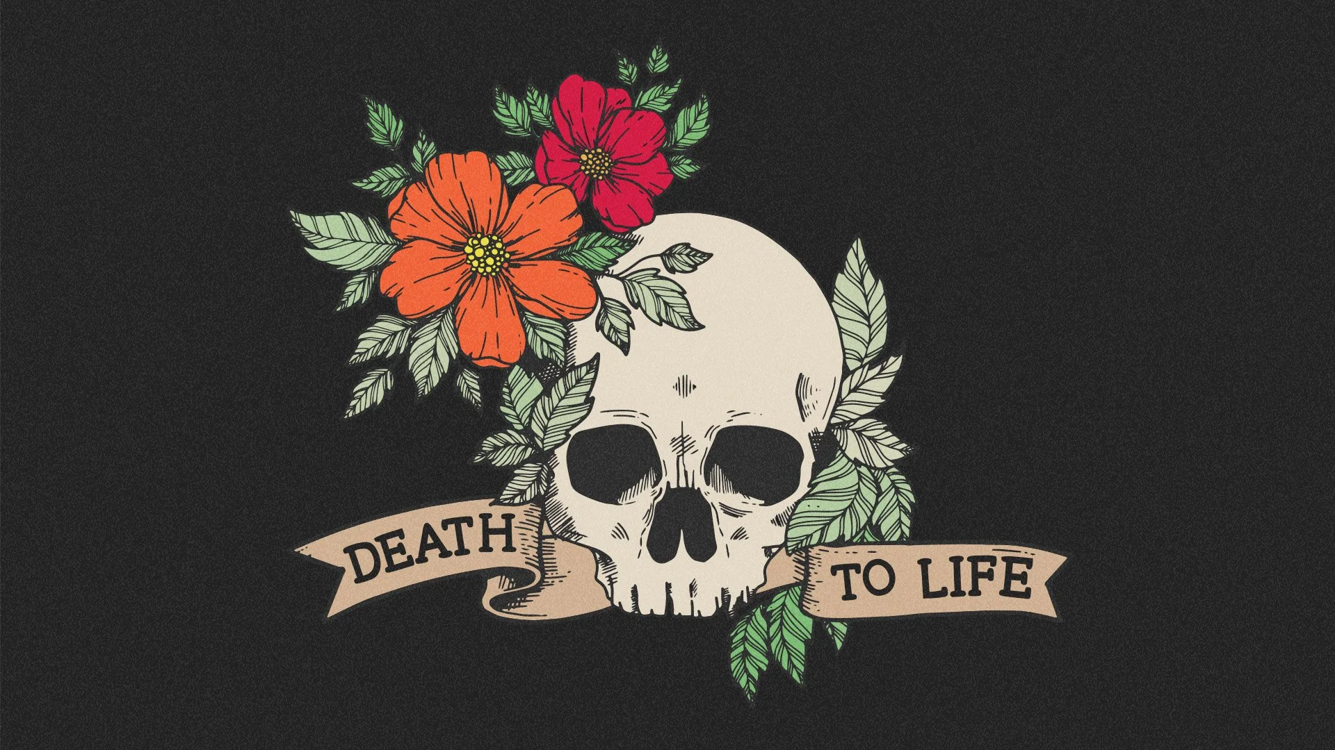
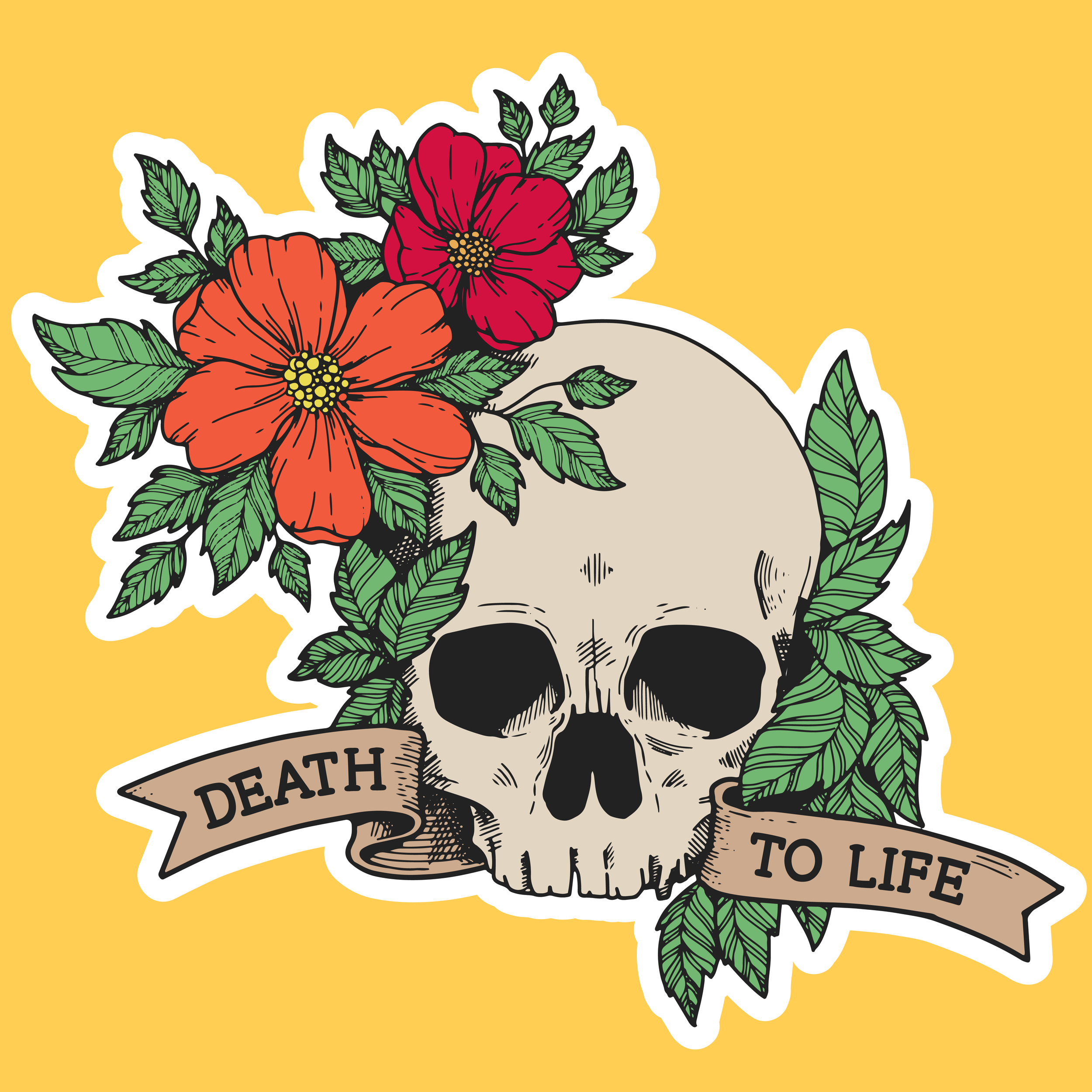
The concept started with a tattoo. Fine-line tattoo art — skulls, florals, banners — carries a specific cultural meaning: something beautiful growing out of something dead. Flowers blooming from a skull. Life emerging from death. It was the perfect visual metaphor for a series about transformation, and it gave the entire campaign an unexpected edge — something that looked nothing like typical church design and everything like something people would actually want on their bodies.
As it turned out, at least one person did.
The Build
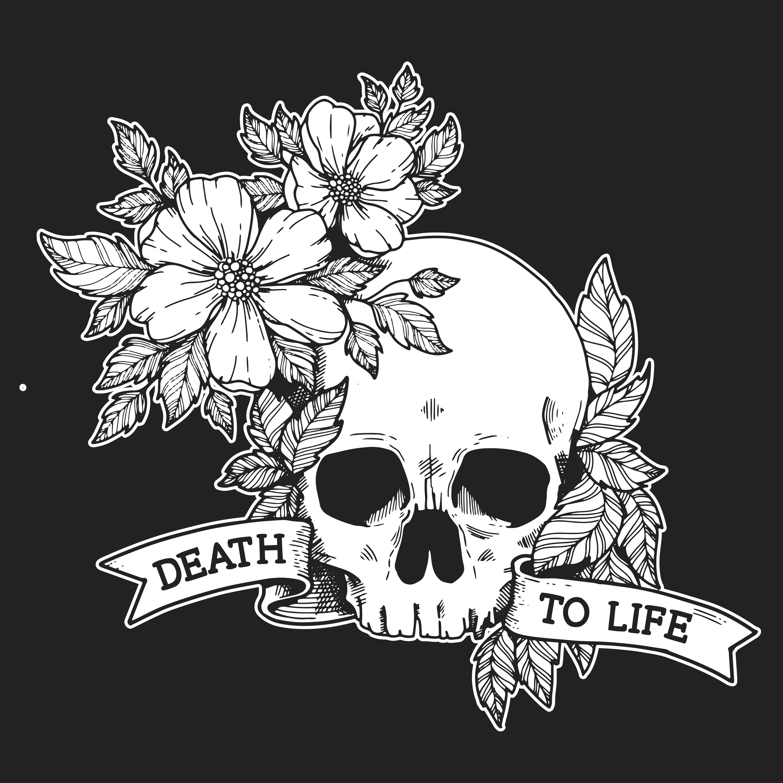
The main illustration — a skull wreathed in flowers with a hand-lettered banner reading "Death to Life" — was built in the fine-line tattoo tradition, available in both stark black and white and a warmer color version with orange and red blooms and deep green leaves. Both versions were deployed across the campaign, giving the series visual flexibility without losing the core identity.
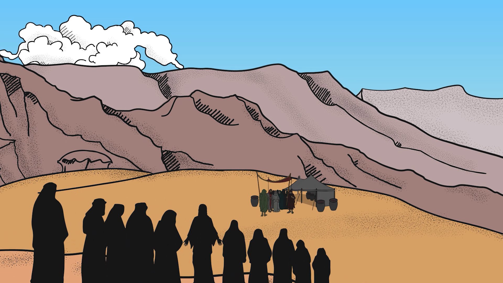
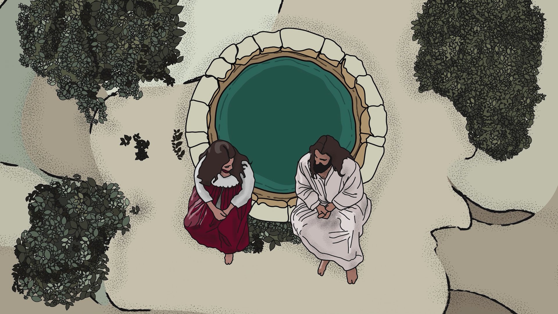
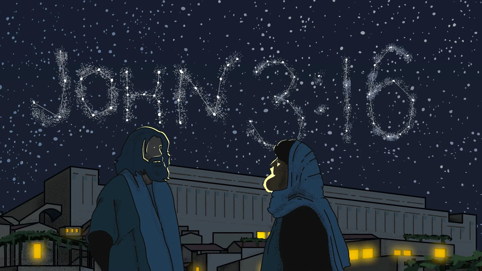
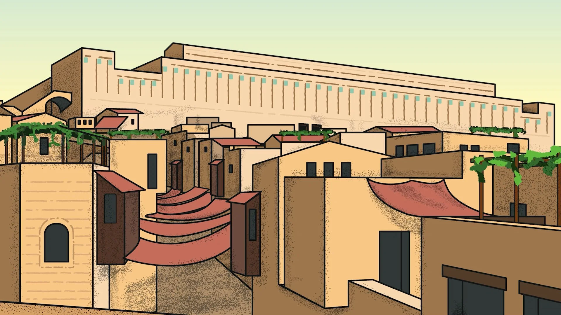
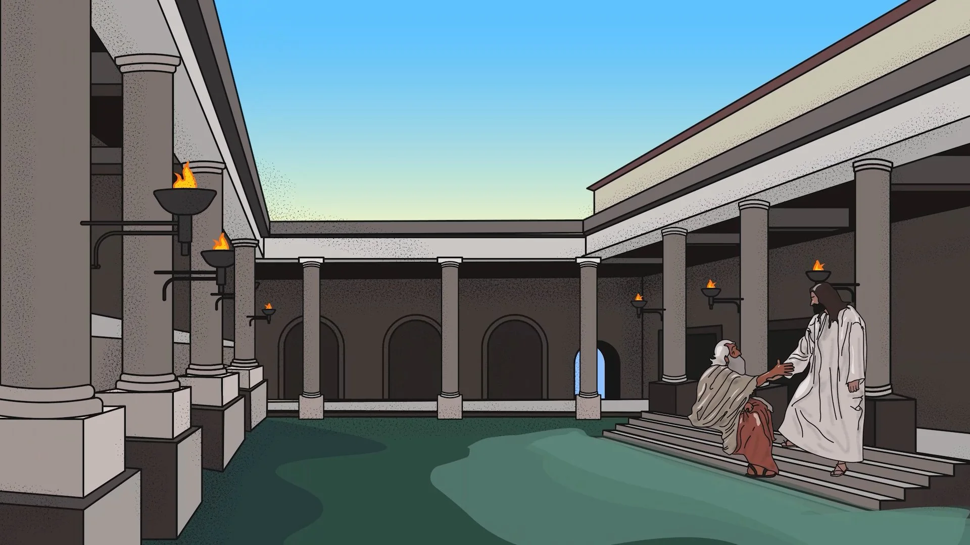
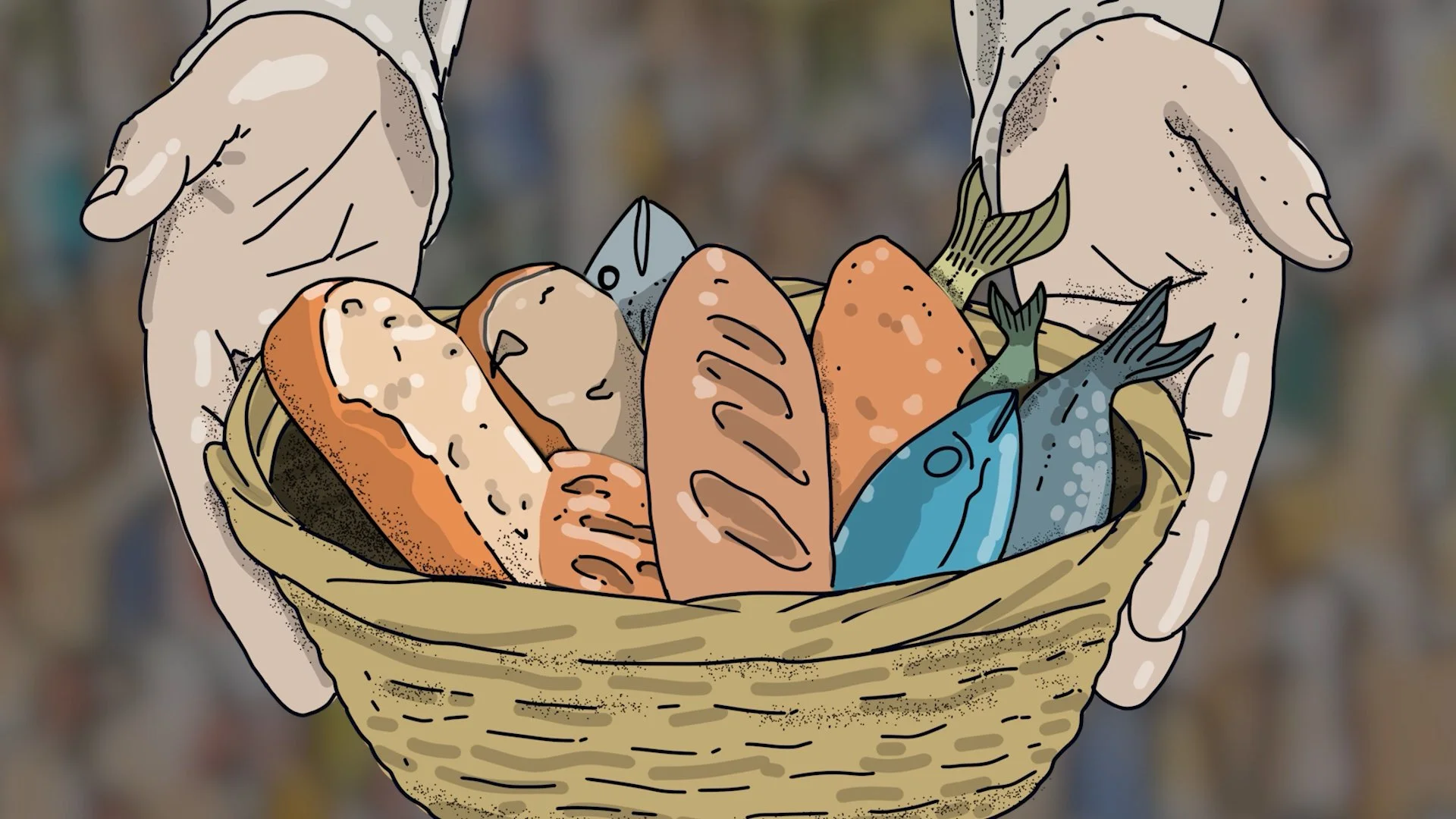
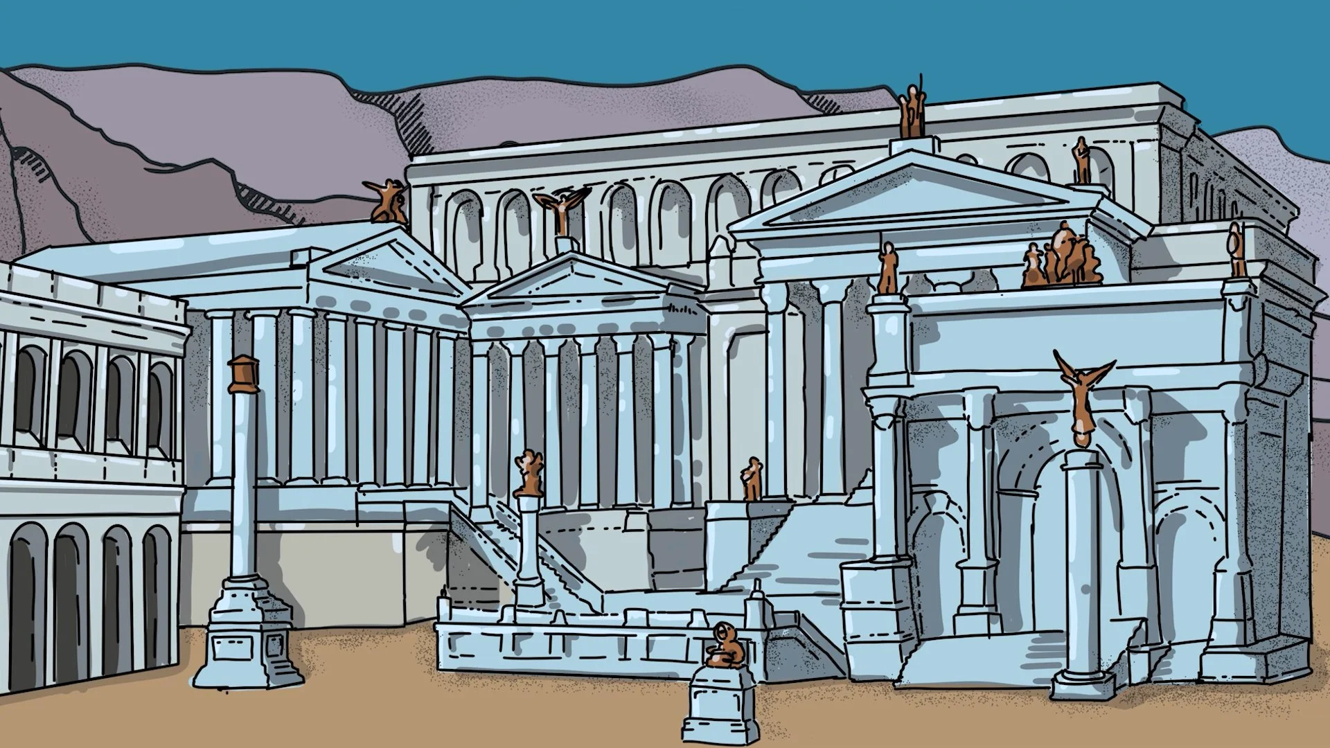
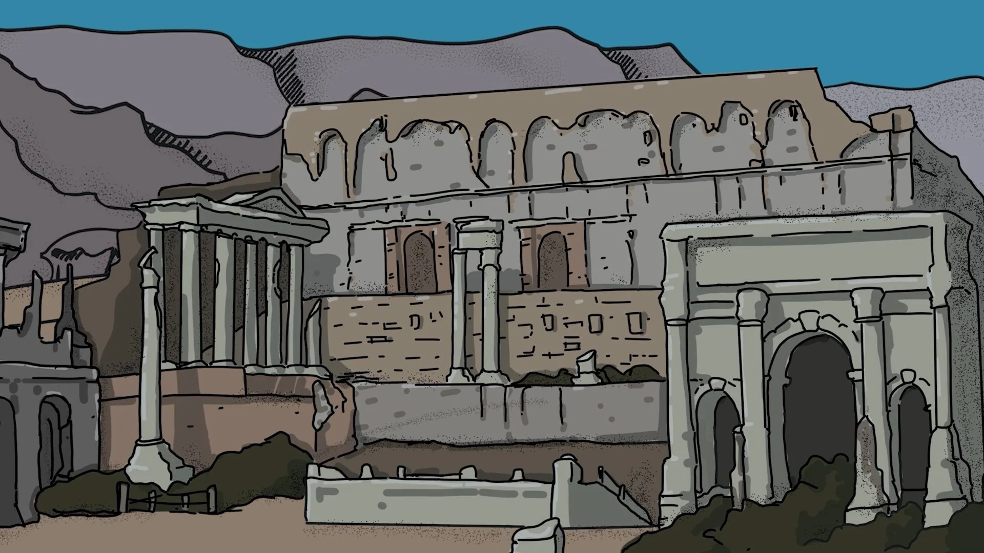
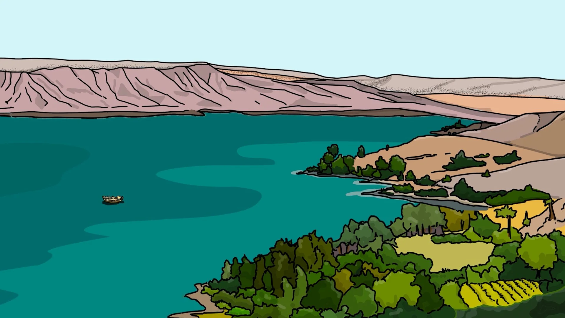
Then came the weekly animations. Each of the seven signs in John's Gospel received its own hand-illustrated scene, drawn from scratch in Procreate on iPad, refined in Adobe Illustrator, and animated in After Effects. Every week was a completely different visual mode — a sun-drenched aerial view of the Sea of Galilee, the Jerusalem cityscape shifting from day to night, a Roman forum illustrated in two states (glory and ruin), a crowd of hundreds of individual silhouettes, a close-up of hands holding loaves and fish, the Man/God split composition. Seven scenes, seven distinct visual environments, seven weeks of shipping on deadline.
The Output
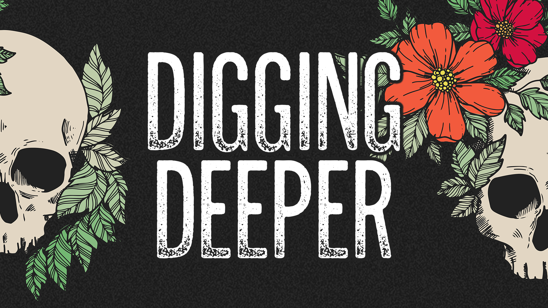
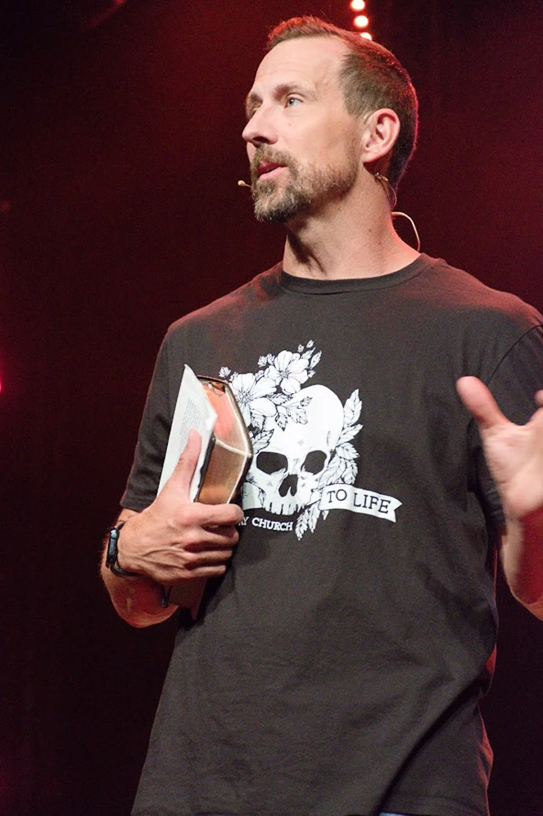
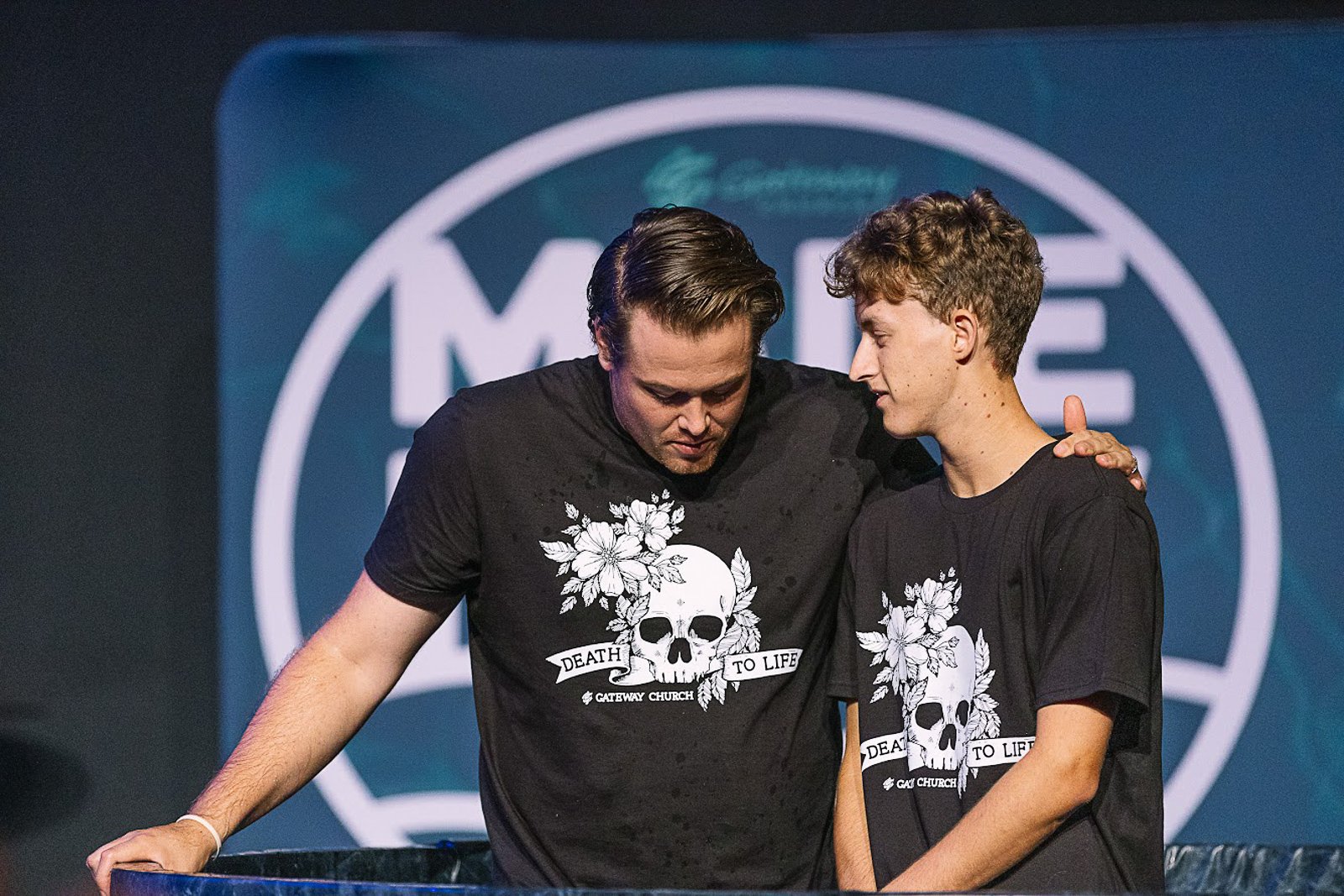
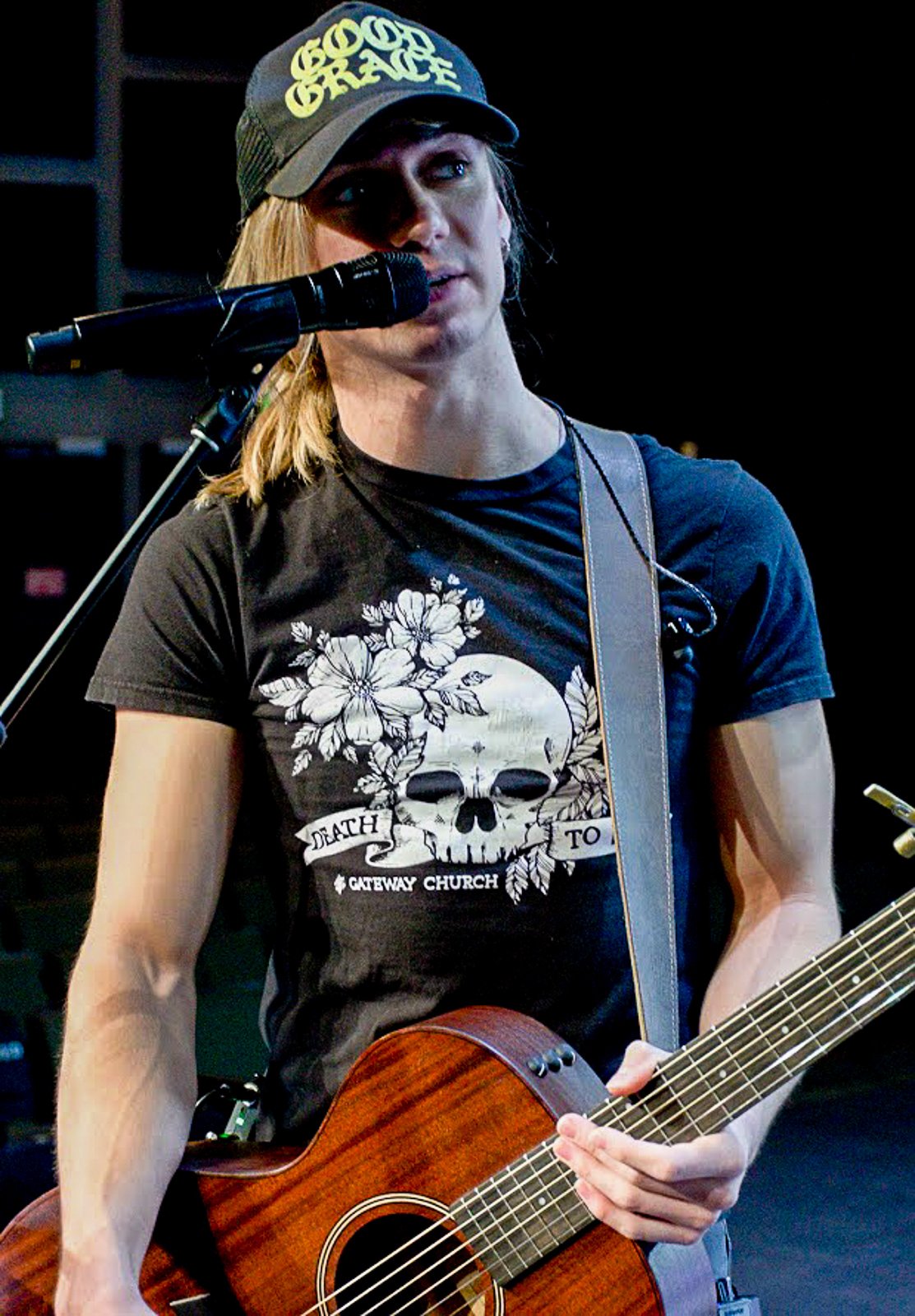
The campaign extended across social media graphics, podcast artwork, broadcast lower thirds, message title slides, a multi-week reading plan, and — most memorably — a t-shirt that became one of the most talked-about pieces Gateway had ever printed. The skull/floral design translated perfectly to apparel, and the shirts were distributed widely enough that at least one person loved the design so much they had it permanently tattooed on their body.
From screen to shirt to skin — not many campaigns make that journey.