TABCO COFFEE Brand Identity · Logo Design · Print Production · Physical Fabrication
The Idea
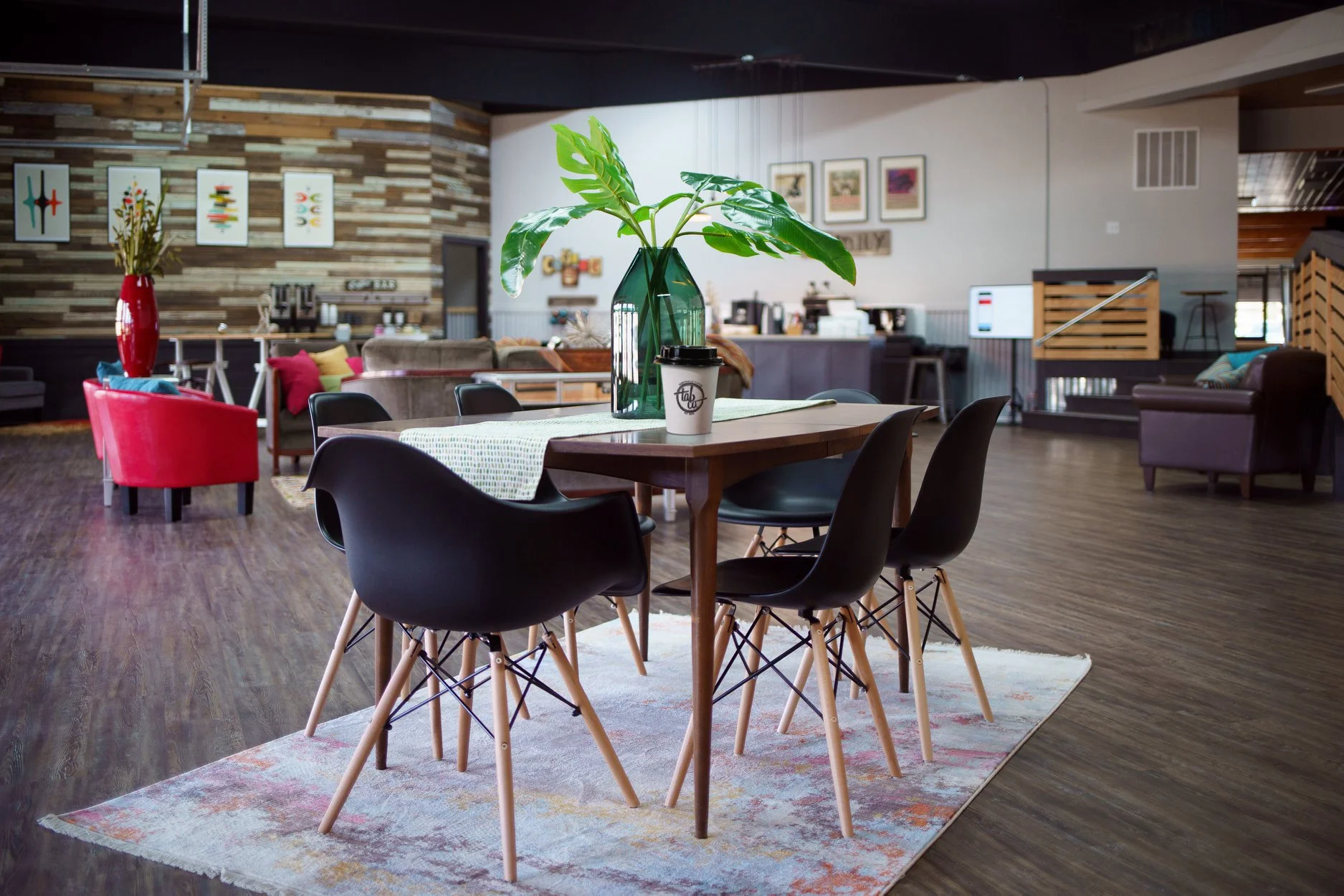
When a growing church outgrows its kids space and builds an entire new children's wing, you're left with a question: what do you do with several thousand square feet of green carpet and pallet décor? The answer, in this case, was to build something nobody expected a church to have — a genuinely good coffee shop with its own identity, personality, and brand that could stand completely on its own. Not a lobby amenity. A parallel brand. The kind of place that felt like it belonged on a street corner in East Austin rather than tucked inside a Sunday morning.
The name came first: Tabco. A compression of Tabernacle into something that sounded like it belonged on a bag of single-origin beans.
The Build
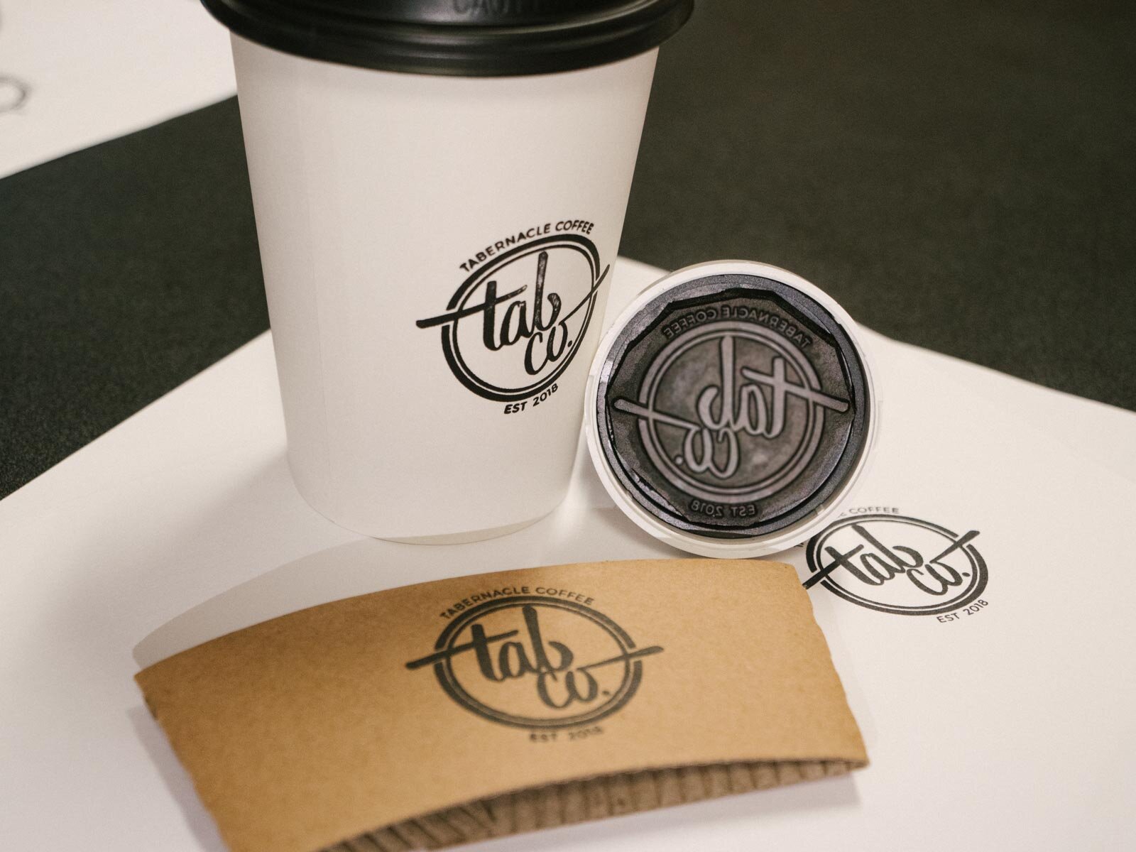
The logo started with a brush pen — hand-lettering the word "tabco" until the weight and warmth felt right. The best version was captured with Adobe Capture, brought into the CC library, and refined into a full mark in Illustrator. Keeping the hand-lettered DNA intact was intentional — it gave the brand the kind of human craft that a purely digital logo never quite achieves. A physical rubber stamp was made from the finished mark, which became the primary application tool for cups, sleeves, and packaging, preserving that tactile handmade quality all the way to the final product.
The brand extended into the space itself — vintage-style coffee blend posters designed in a retro travel poster aesthetic were framed and hung behind the counter, turning the service area into a visual destination. The result was a space that felt curated and considered, the kind of place people actually want to spend time in.
The Output
Branded cups, coffee sleeves, a custom rubber stamp, environmental signage, and framed wall art — all deployed inside a completely reimagined space that went from children's ministry to neighborhood café. The transformation was total: same square footage, completely different world.
OLD KIDS SPACE
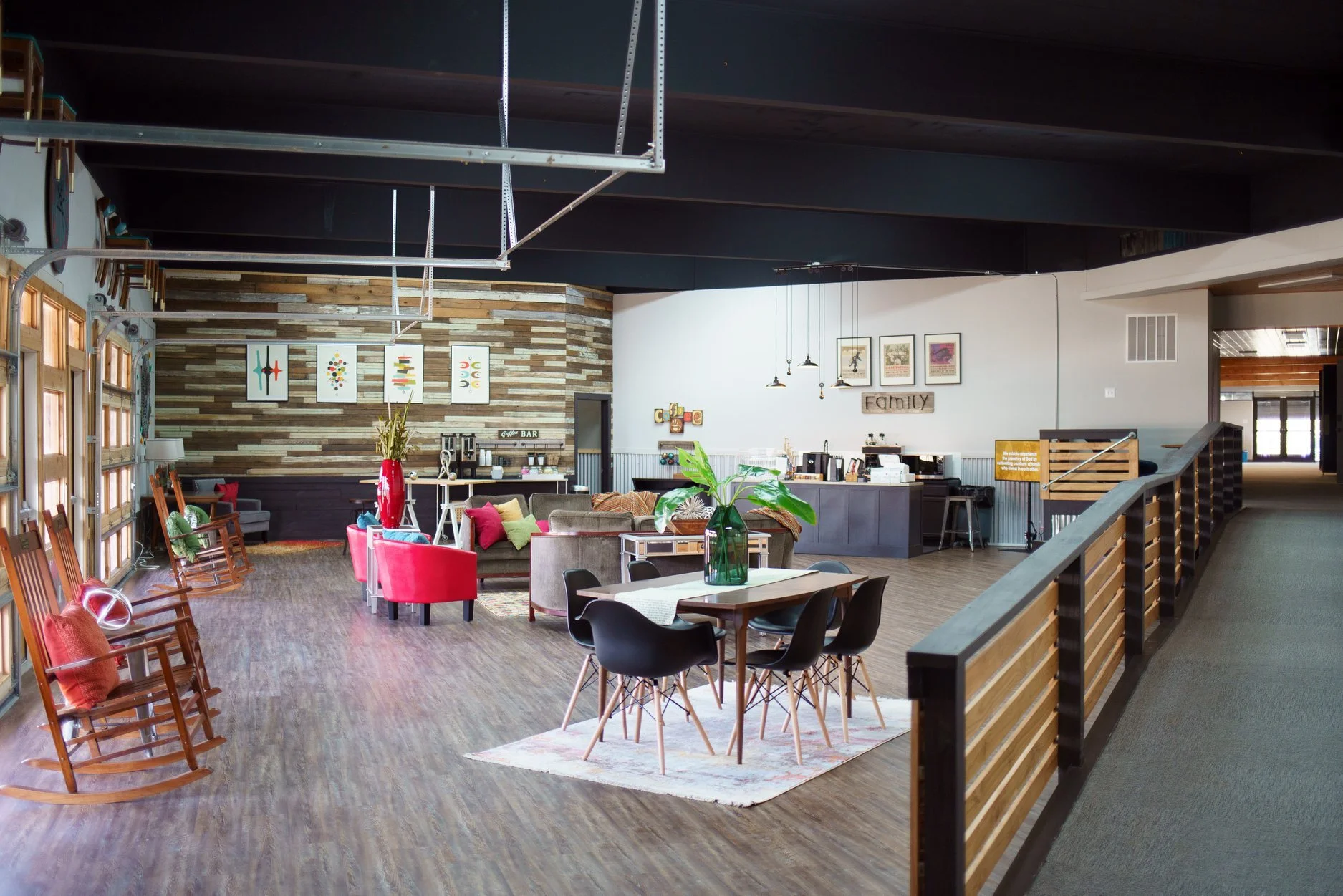
RENOVATED SPACE