

MARK: A THREE-PART CAMPAIGN Campaign Design · Illustration · Print Production · Broadcast Design
The Idea
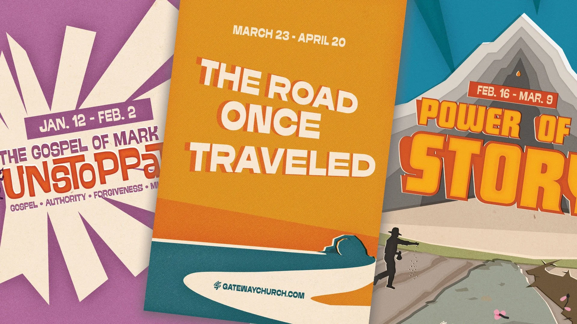
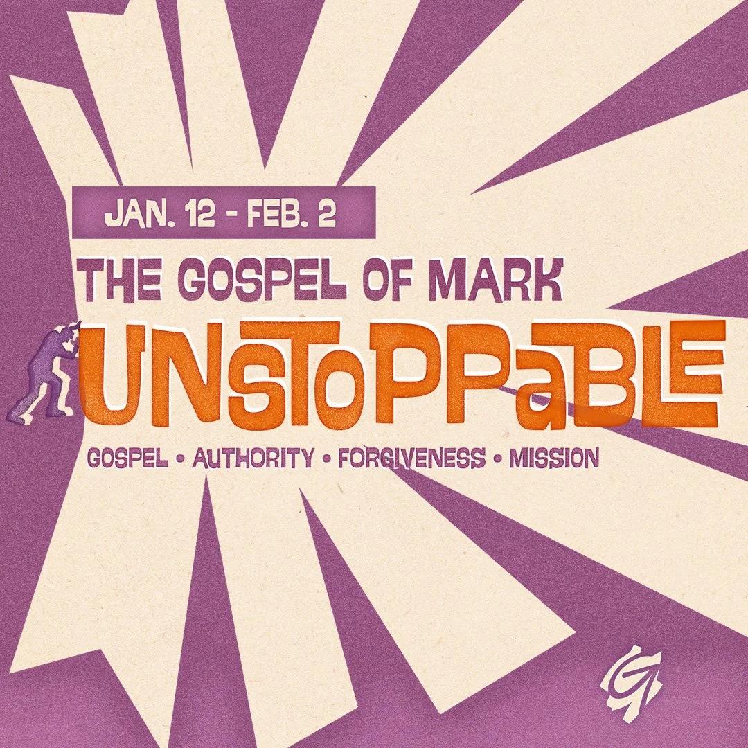
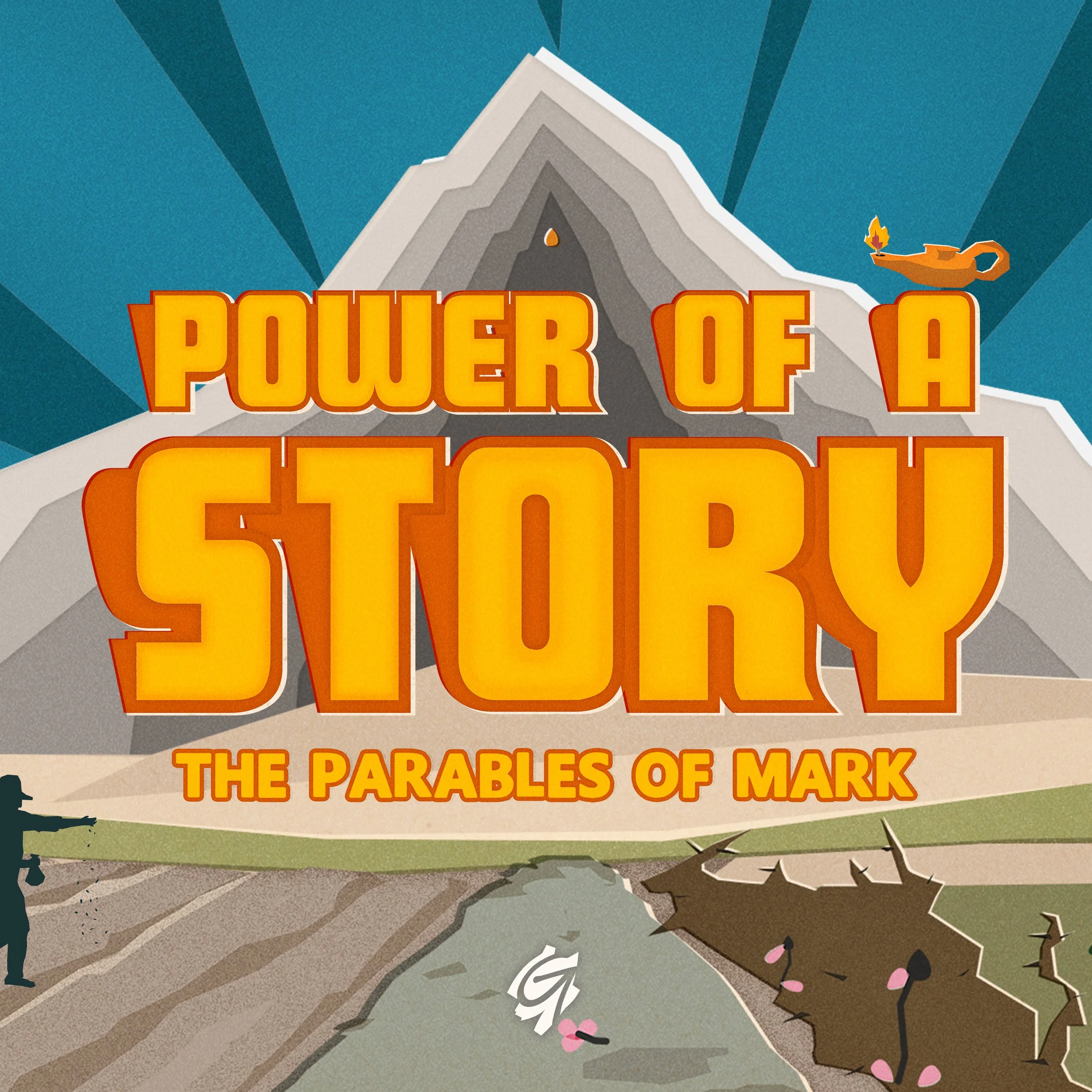
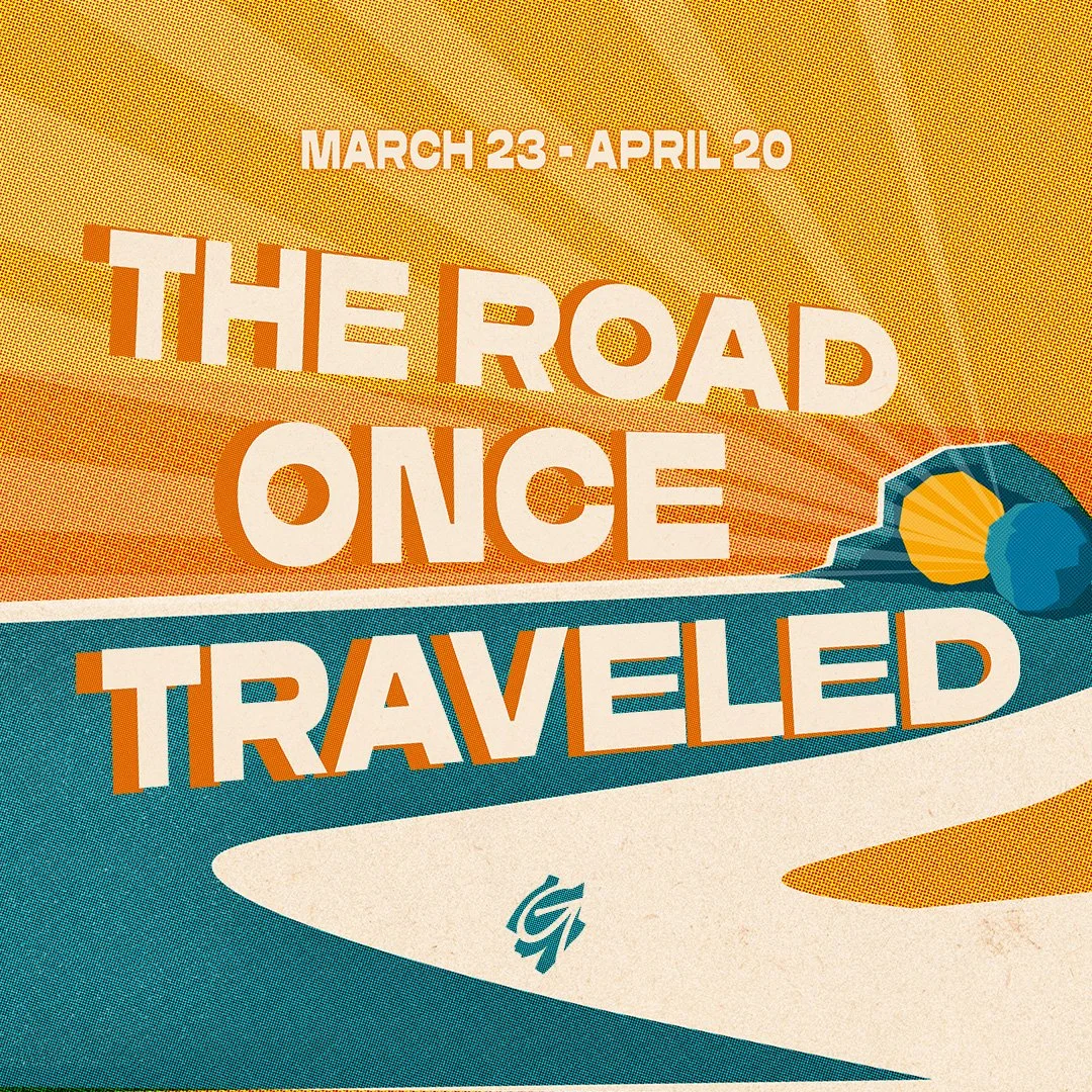
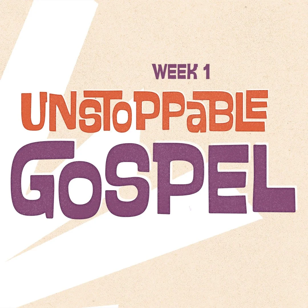
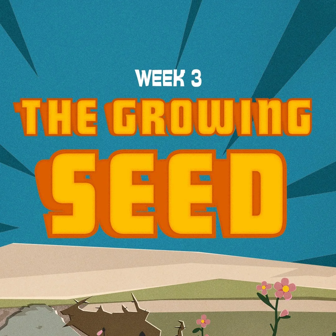
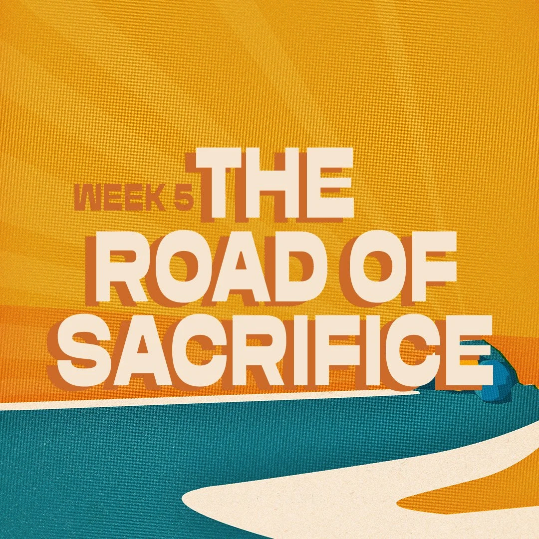
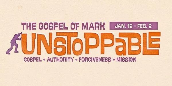
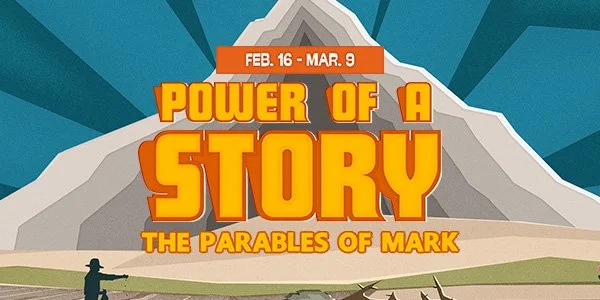
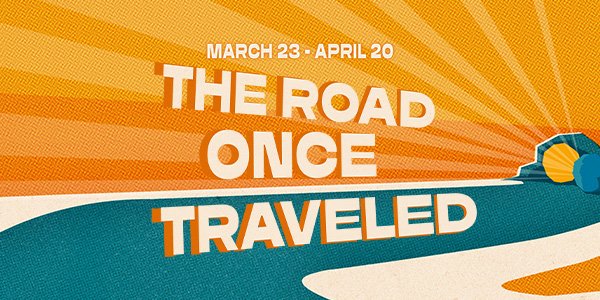
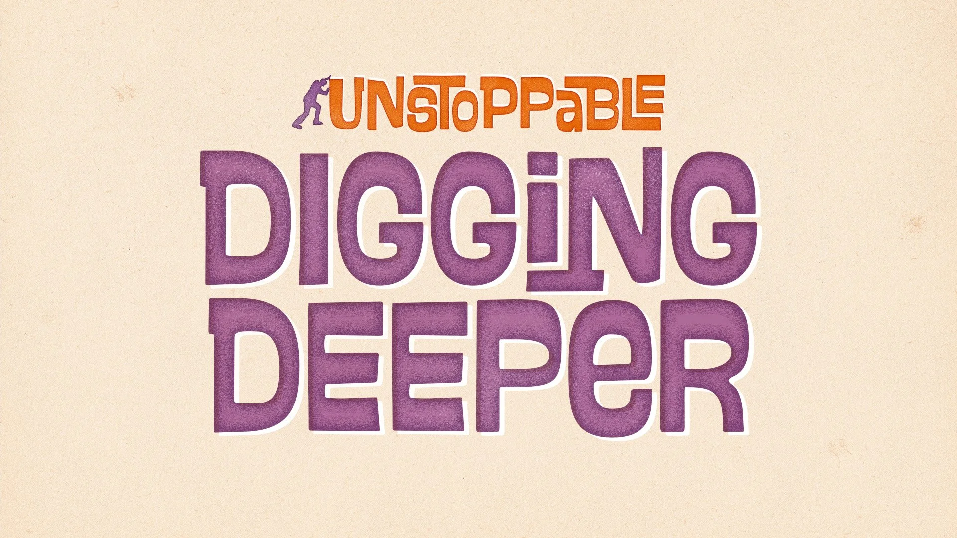
Three consecutive series. One visual throughline. The challenge was designing a multi-month campaign that could evolve aesthetically week over week — and part to part — while still reading as a coherent body of work to an audience of thousands across multiple campuses. Each installment needed its own personality: Unstoppable called for raw kinetic energy, Power of a Story needed warmth and illustration depth, The Road Once Traveled had to carry the weight of a climactic finale. The connective tissue wasn't a shared color palette or typeface — it was a shared production philosophy. Every series was rooted in the actual content: parables, characters, symbols, and narrative beats embedded directly into the illustration work, not bolted on as decoration.
The Build
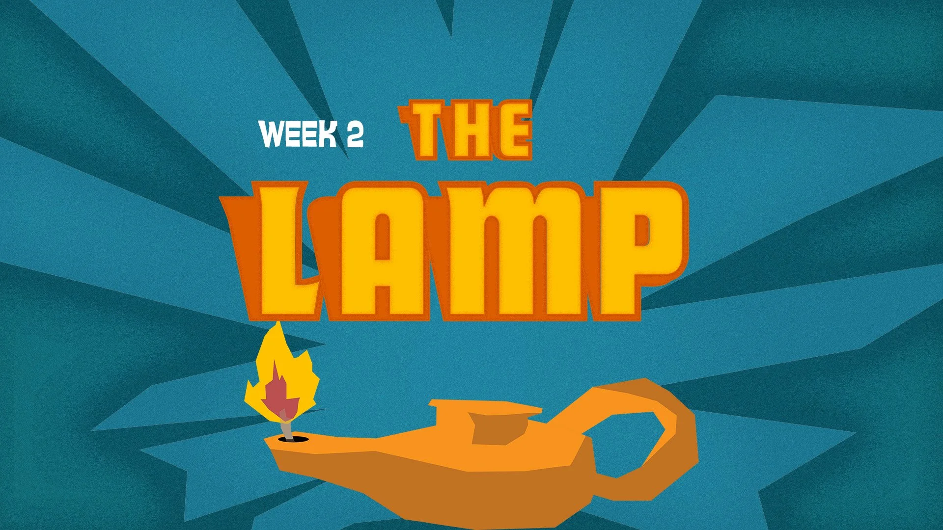
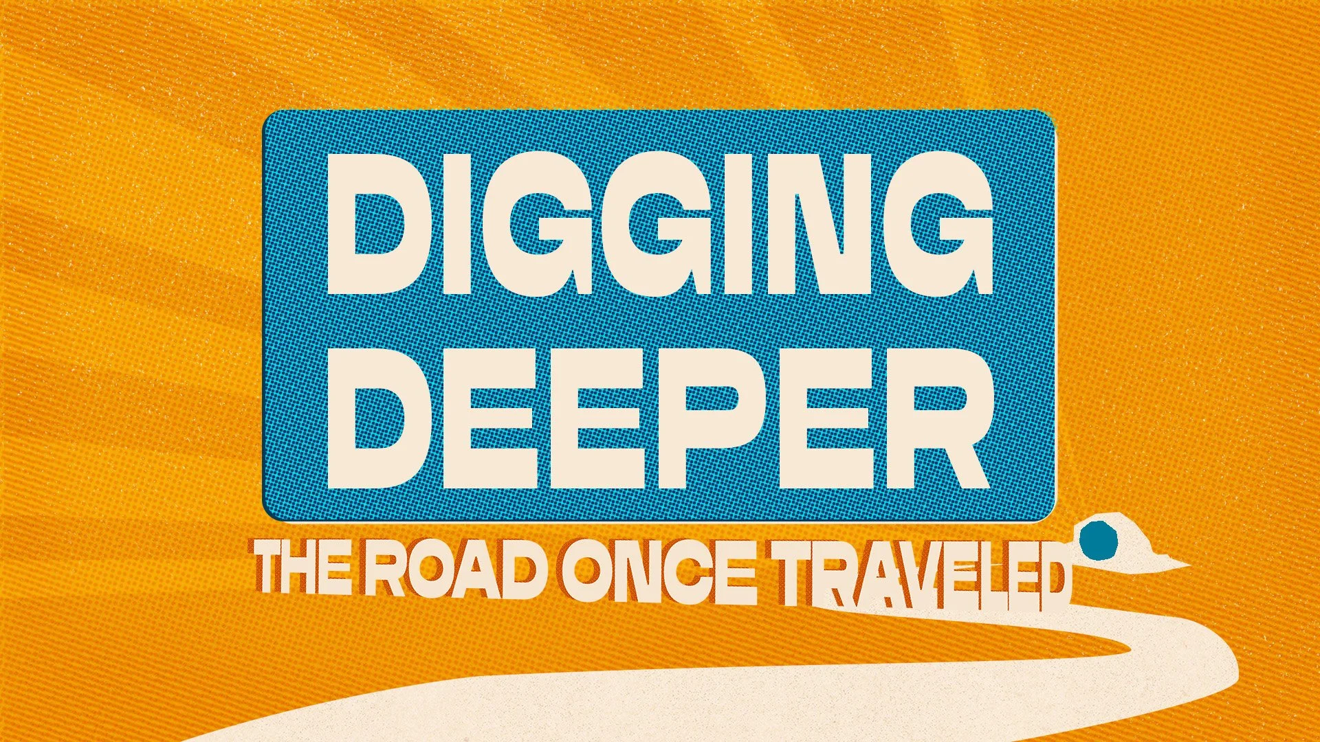
Each system started in Illustrator — full vector builds with deliberate layering, so individual elements could be isolated, repositioned, and resized across every output format without rebuilding from scratch. From there, flat exports went into Photoshop for the treatment pass: halftone screens, noise masks, and grain overlays applied as a finishing layer to push each piece away from clean digital and into something that felt tactile and printed. The result is work that looks like it came off a press, not out of a template. Typography was treated as illustration — the Unstoppable wordmark leans into the figure physically pushing against it, Power of a Story buries parable imagery (the sower, the rocky soil, the oil lamp) into the scene so they reward a second look, and The Road Once Traveled uses perspective and sunburst geometry to build momentum toward Easter. Every week, that system had to produce a full deliverable package: square and horizontal social graphics, widescreen title slides, weekly message titles, next-week teaser graphics, newsletter banners, podcast artwork, and print posters — all on a recurring weekly deadline.
The Output
Across roughly four months, this campaign generated well over 100 individual assets spanning three complete visual systems. Deliverables lived everywhere simultaneously: projected at scale during weekend services, distributed across social platforms in multiple aspect ratios, printed as 11×17 posters, published as podcast cover art, and deployed in email newsletters to a large Austin-area audience. The weekly cadence was unbroken — new message title graphics and teaser slides every single week, on time, every time. The trilogy structure gave the overall campaign an arc that individual series rarely have, and the Illustrator-to-Photoshop pipeline made it possible to maintain that output volume without sacrificing finish quality.