MIXTAPE: THE FORMATIVE YEARS Campaign Design · Fabrication · Photography · Illustration
The Idea
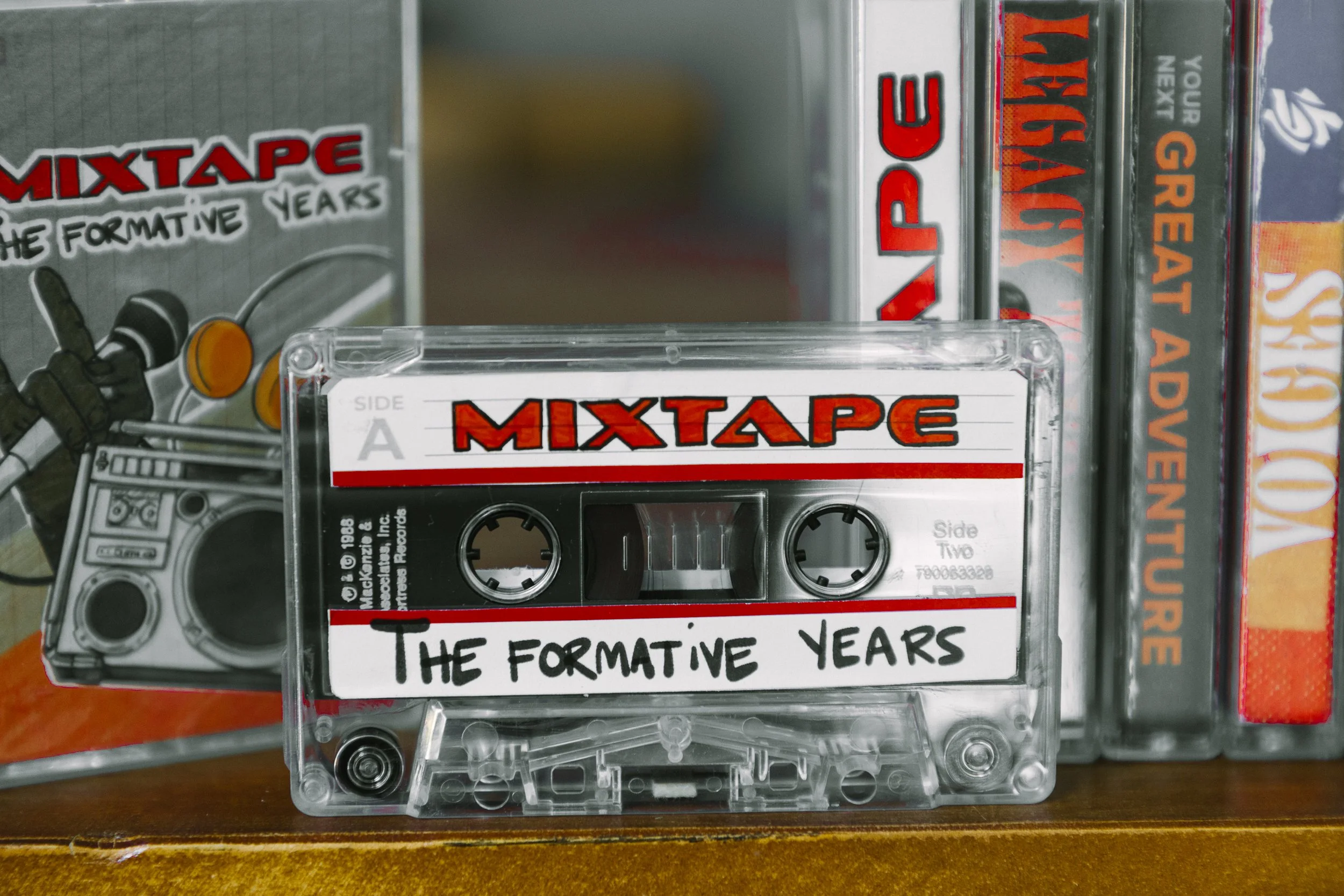
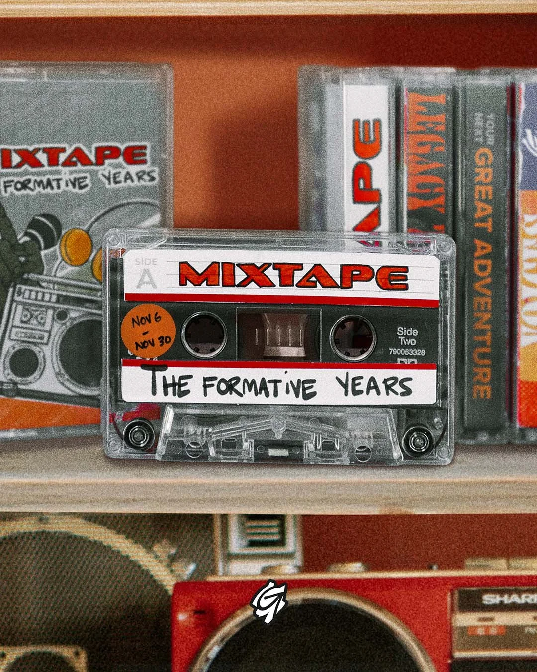
The brief was a series about how music shapes identity — the songs that get lodged in your brain and quietly form the way you see the world. The concept almost wrote itself: make it feel like a cassette tape. Not as a visual metaphor slapped onto a stock photo, but as an actual physical object, designed and fabricated from scratch. The campaign needed to feel like something you'd find in a shoebox in your parents' garage — worn, specific, and personal. That meant the art direction couldn't stop at a screen. It had to get physical.
The Build
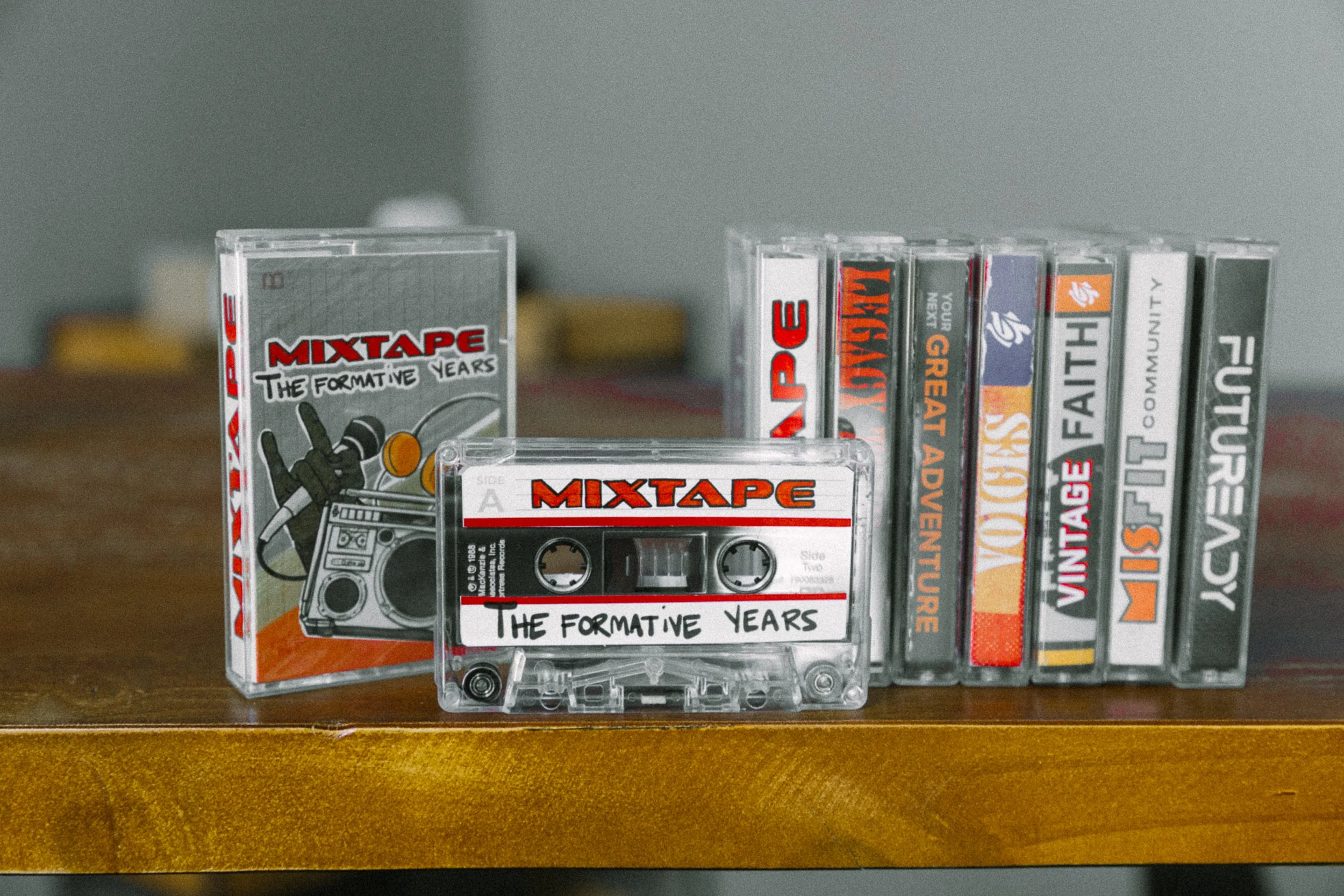
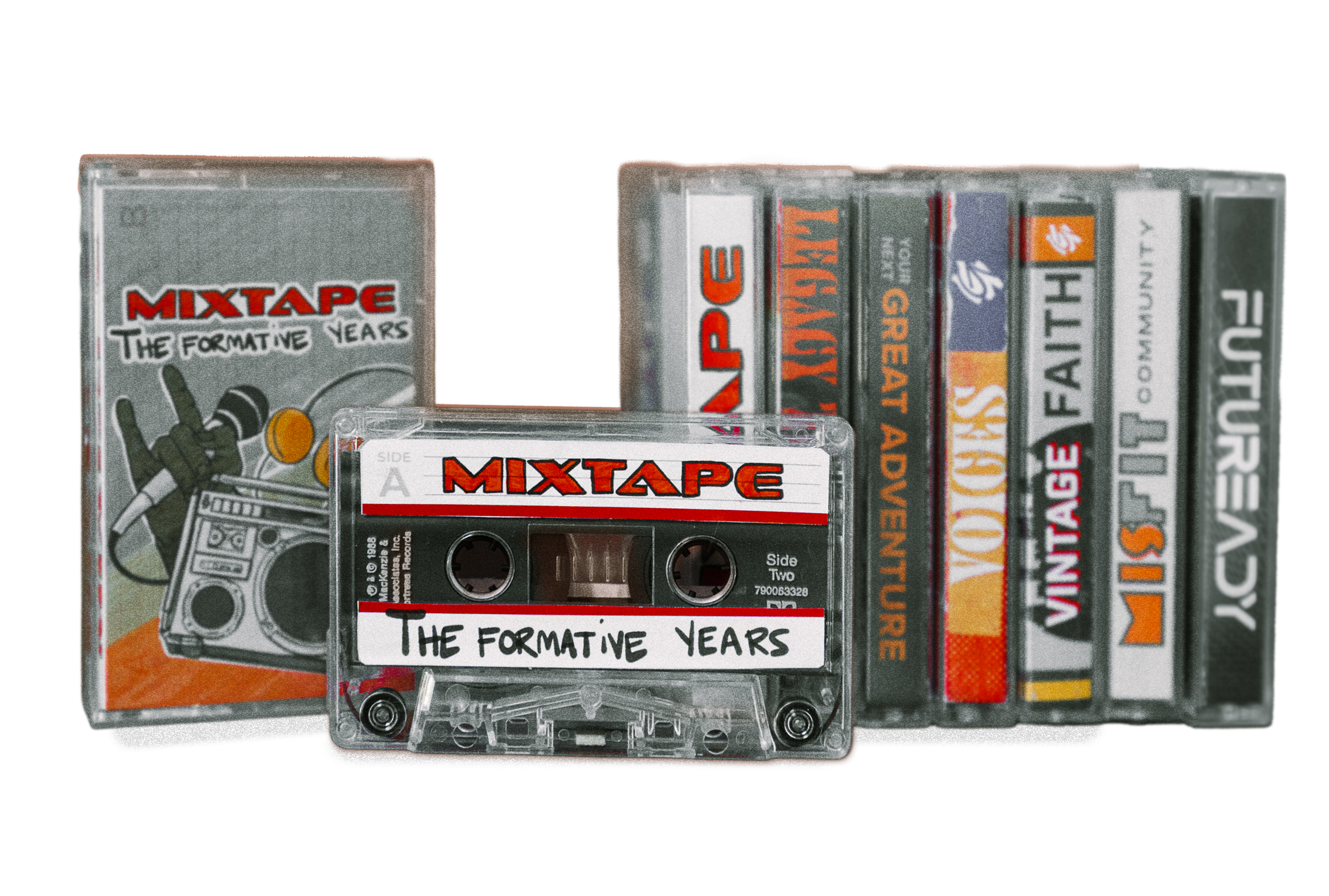
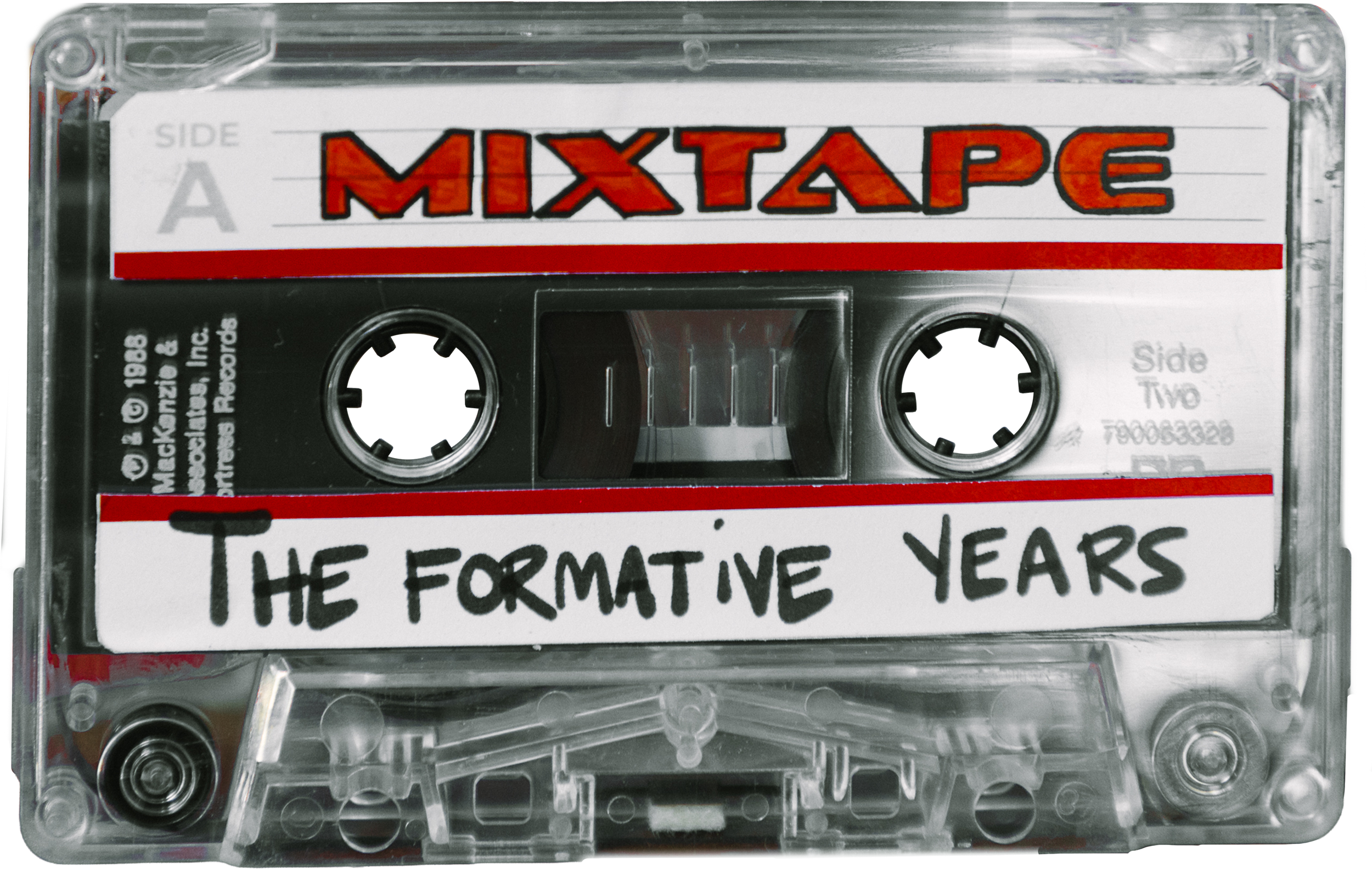
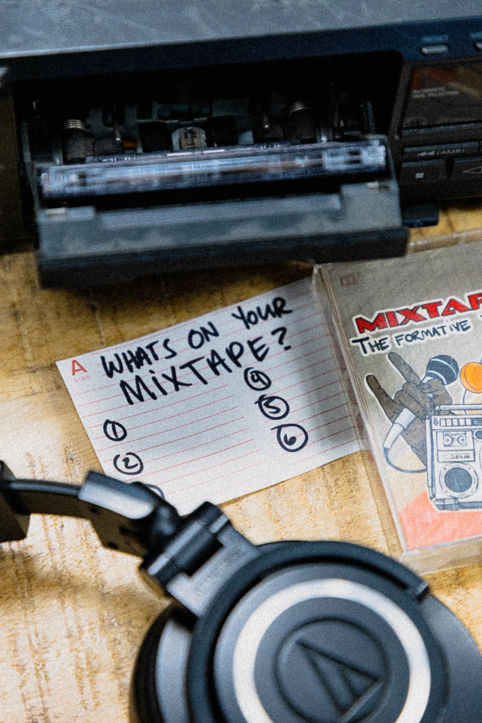
The process started in Illustrator, building out custom cassette labels and J-card inserts at real-world dimensions — typography, layout, the whole package treated as actual print production. From there, the label artwork moved into Procreate, where illustrated elements were drawn directly onto the label mockups to give them the hand-done quality of something someone actually made in 1994. Back into Photoshop for cleanup, color treatment, and composite work, then out to the printer. The printed labels and inserts went into real cassette tapes. Then everything hit the light table: a full product photography session that also included custom inserts designed for several other past series, all shot together to build out a wall-of-tapes archive tableau that became the campaign's signature background texture. The result was a set of photos where every element — label, insert, tape, shelf — was designed, fabricated, or art-directed in-house. Nothing in frame was accidental.
The Output
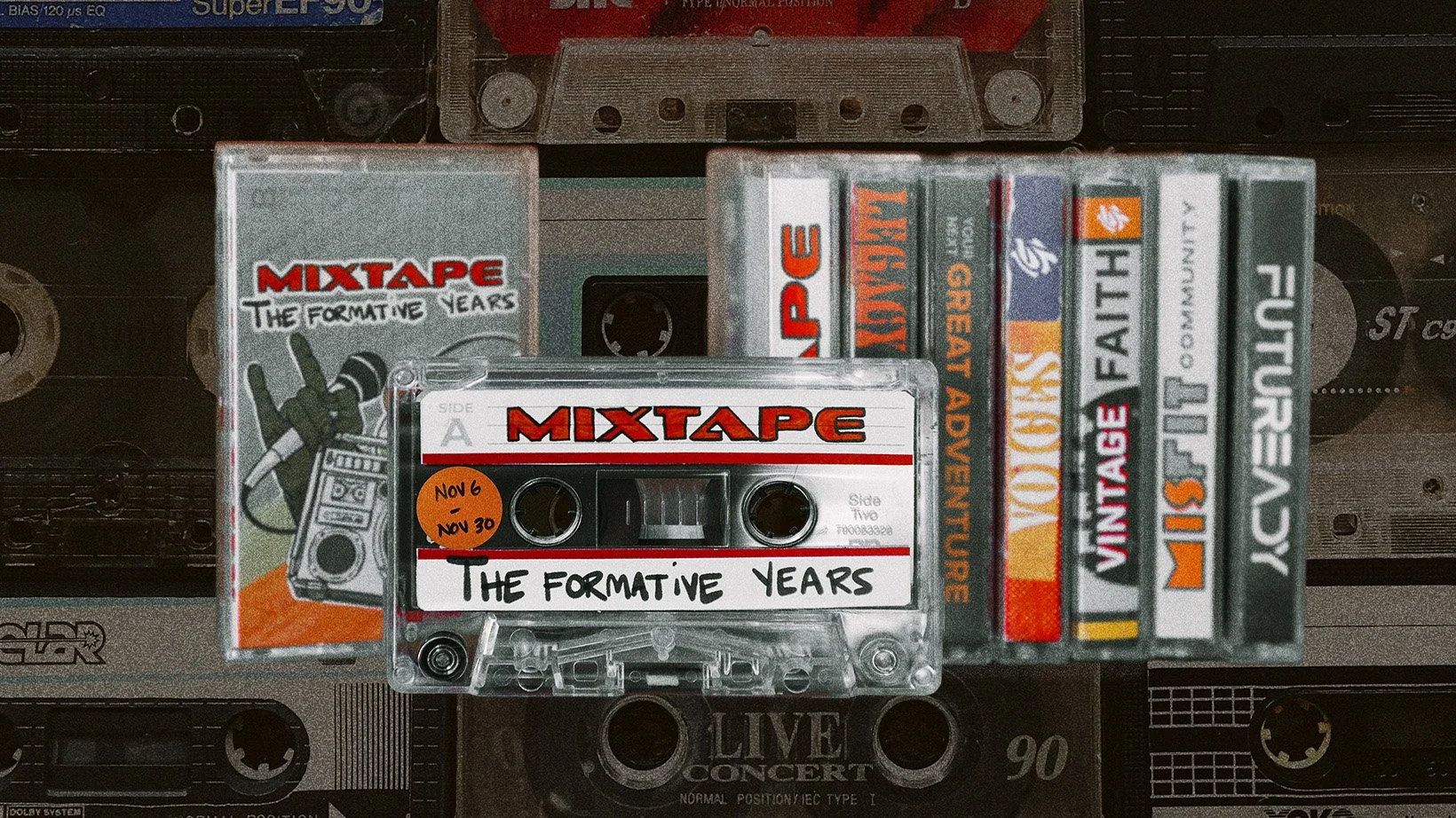
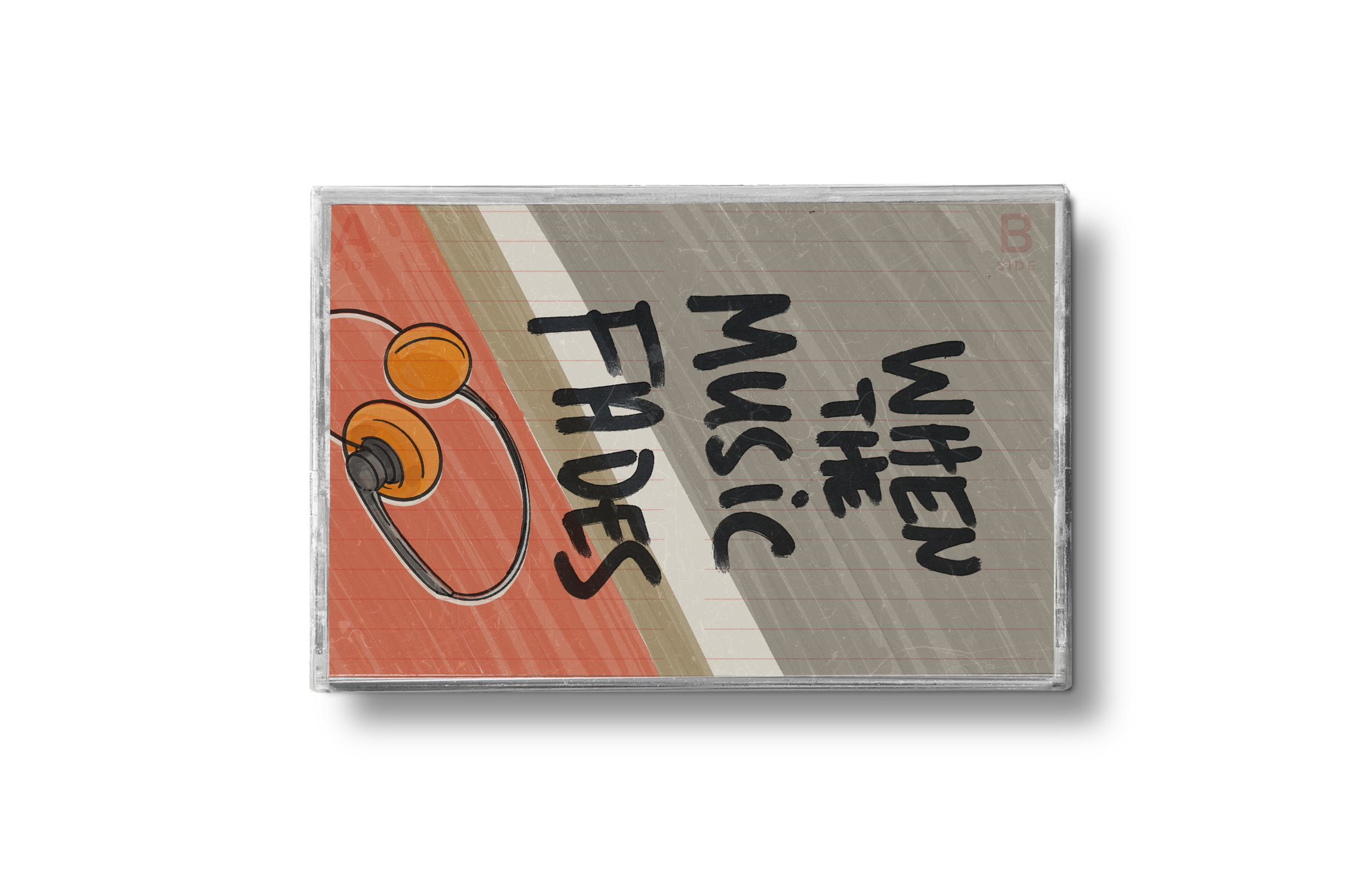
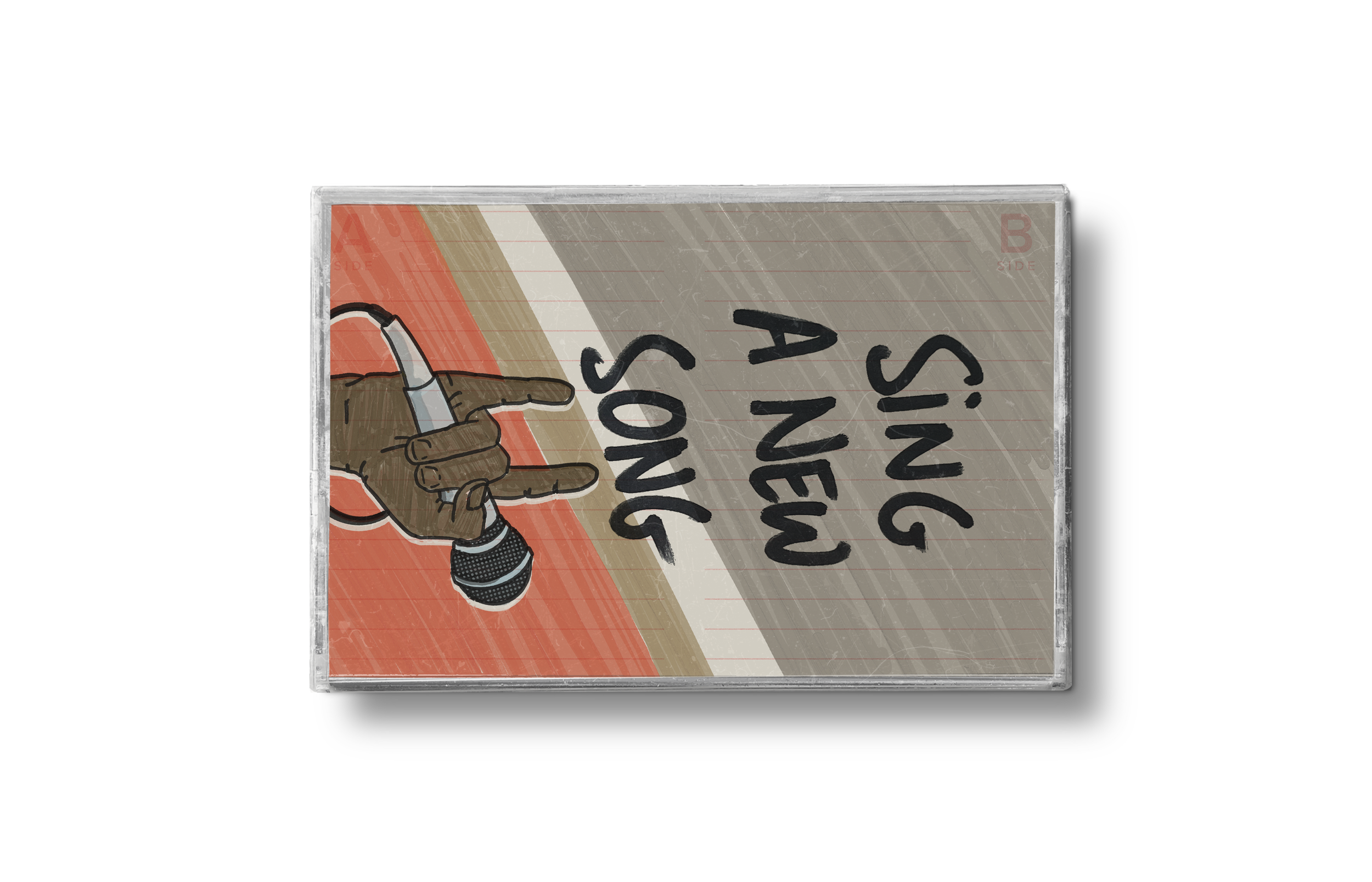
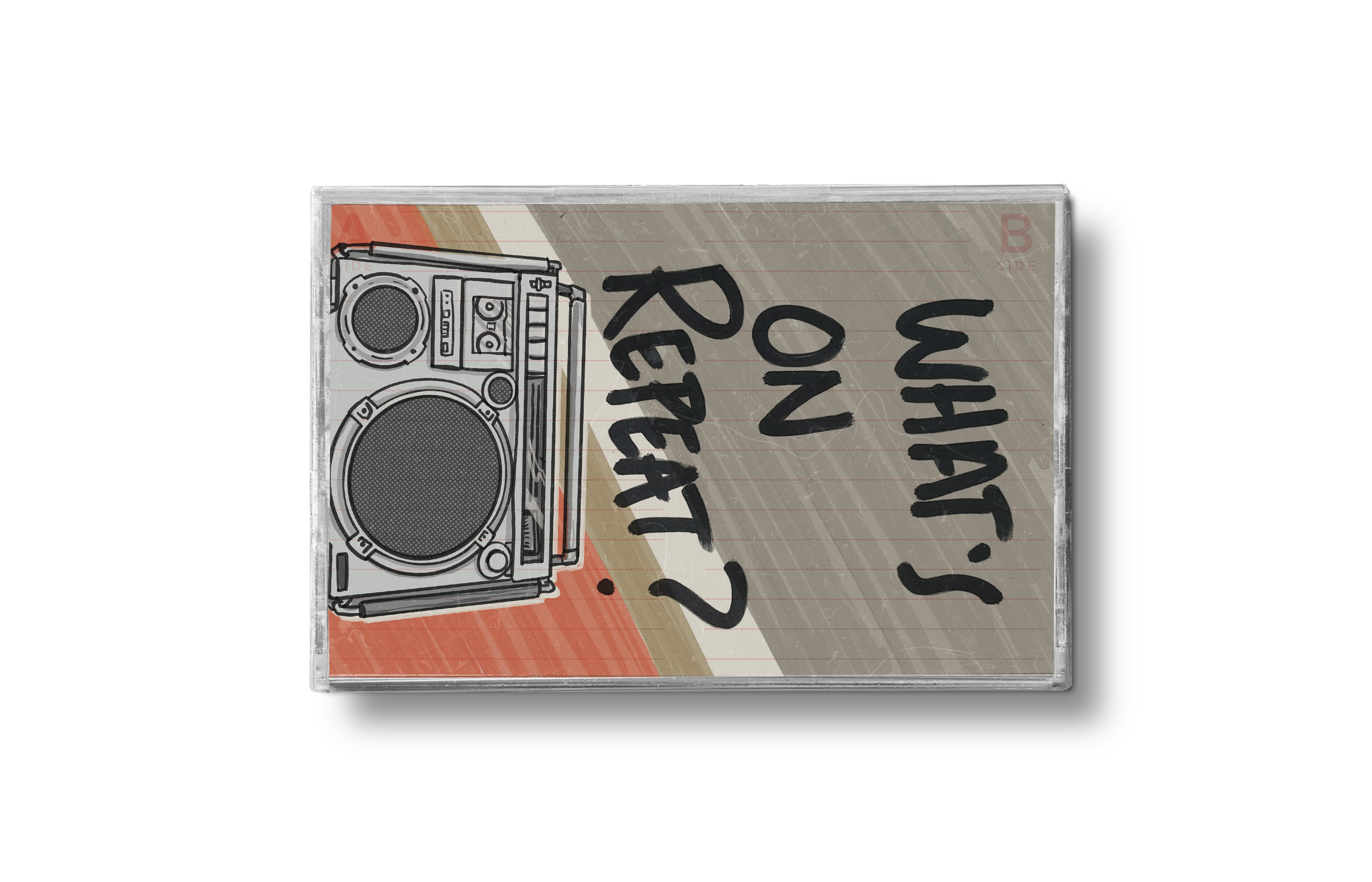
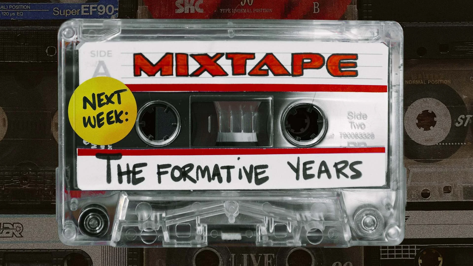
The photography became the foundation for the entire asset library: widescreen title slides, weekly message graphics, next-week teasers, lower thirds, social verticals, a Facebook banner, podcast cover art, a Digging Deeper teaching series package, and a broadcast SuperSource layout — all pulled from the same photographic system. Weekly message titles used a separate design approach, with illustrated cassette inserts standing upright against the warm red-brown background, each one hand-lettered in Procreate with its own color palette and illustration. The campaign ran across multiple campuses and digital platforms simultaneously, with every touchpoint — from a 40-foot projection to a 1×1 social post — traced back to a physical object that actually existed.